Huobi is a leading global cryptocurrency exchange and blockchain service provider that was founded in 2013 by Leon Li in China. It was initially launched as a Bitcoin trading platform and then quickly expanded to offer a wide range of digital asset services. These included spot trading, derivatives, staking, and blockchain-based financial solutions. Over the years, Huobi has grown into one of the world’s most recognised crypto brands, and it serves millions of users across multiple regions.
Besides, Huobi is known for its innovative approach, robust security measures, and a commitment to regulatory compliance. It has played a key role in shaping the global cryptocurrency ecosystem. The article explores the evolution of the Huobi logo, among other details of the company.
The Genesis of the Huobi Logo (2013 – 2022)
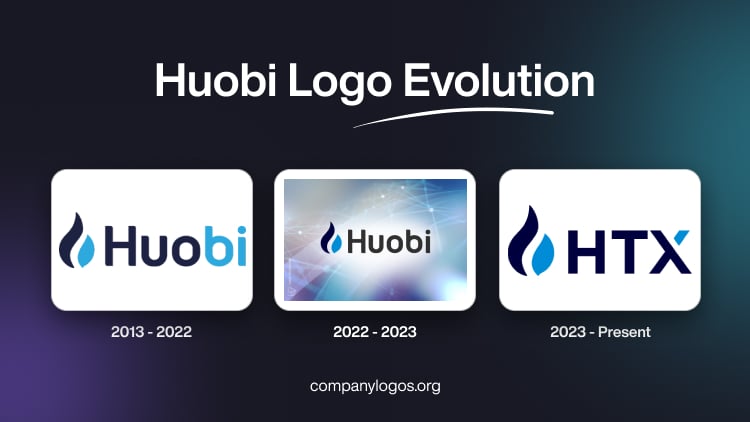
The original logo consisted of a flame motif in dark navy blue and vibrant blue symbolising “fire currency” and the wordmark “Huobi” or “Huobi Global” in a title case. Interestingly, the first three letters of the “Huobi” wordmark were shown in dark navy blue, while the last two were shown in vibrant blue. However, “Global” was shown in dark navy blue only. The twin-colour style of the “Huobi” wordmark resembled the colour style of the flame motif. The stylised flame motif looked like twin droplets in dark navy blue and vibrant blue.

(2022 – 2023)
The year 2022 saw the rebranding of the company, wherein it came to be known as “Huobi” instead of “Huobi Global”. The flame motif in a dark navy blue and vibrant blue colour palette appeared to the left of the brand name in a rounded, geometric sans-serif typeface in dark navy blue.

(2023 – Present)
The company was rebranded again in September 2023, when it came to be known as “HTX”, or the “Huobi Tron Exchange”. Here, the flame motif was accompanied by the wordmark “HTX” in a rounded sans-serif typeface. The top right section of the letter “X” is depicted in vibrant blue.

The Elements of the Huobi Logo
Font
The Huobi wordmark is written using a rounded sans-serif typeface. It is designed to look contemporary, smooth, and highly legible across digital platforms. The uppercase letterforms in “HTX” give the brand a friendly and accessible tone. At the same time, the rounded terminals and balanced spacing suggest openness and modernity.
Colour
The Huobi logo’s colour palette consists of deep navy blue and vibrant sky blue colours. Here, deep navy blue represents trust, stability, and strength, and it symbolises Huobi’s reliability as a financial institution. The vibrant sky blue colour represents innovation, technology, and forward motion. Besides, it reflects the brand’s dynamic energy and focus on progress.
Finally
The evolution of the Huobi logo reflects the brand’s transformation from a domestic cryptocurrency exchange in China to a globally recognised digital asset powerhouse. The logo has remained the defining symbol of Huobi’s identity, and it represents energy, innovation, and the unstoppable growth of blockchain technology.