Chainalysis is a leading blockchain analysis company founded in 2014 by Michael Gronager, Jonathan Levin, and Jan Moller. It specialises in analysing cryptocurrency transactions to support compliance, investigations, and financial transparency. Over the years, Chainalysis has grown to become a trusted blockchain data platform for governments, financial institutions, and cryptocurrency businesses worldwide. Its logo has played a key role in visually communicating the company’s values of trust, innovation, and clarity. The article explores the logo evolution of Chainalysis over the years, among other details of the company.
The Genesis of the Chainalysis Logo (2014 – 2016) (Unavailable)
Although the original Chainalysis logo is not documented, it is believed to have been a clean and modern one that reflected the tech-forward nature of its business. The logo seemed to have featured the company name in a straightforward, sans-serif typeface. This minimalist approach avoided any graphical element, and instead focused on clear readability and professionalism.
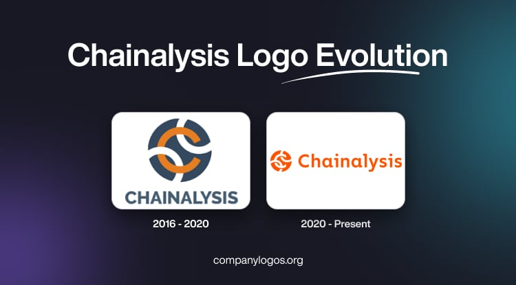
(2016 – 2020)
The 2016 logo iteration is arguably the first documented logo of Chainalysis. It features a circular emblem with interlocking chains of white and orange colours against a dark blue background. The interlocking curves or knots create a stylised “C” in orange. The graphical emblem is often paired with the brand name in a title case, either in black or a dark blue tone.

(2020 – Present)
The next logo iteration, which continues to this day, shows the similar graphical emblem and the wordmark, but in an orange and white colour combination. The wordmark in orange is written using a bespoke typeface called Kontrapunkt.

The Elements of the Chainalysis Logo
Font
The Chainalysis wordmark uses a rounded geometric sans-serif typeface called Kontrapunkt in a title case. It is similar in appearance to fonts such as Nunito Sans, Poppins, or Circular Std. It is also likely to be a custom-modified version to create a unique identity. The letterforms are smooth, evenly spaced, and slightly rounded at the edges. These characteristics give the logo a friendly and modern appeal.
Colour
The Chainalysis logo consists of bright orange and white colours. Here, the bright orange colour symbolises innovation, connectivity, and alertness. The colour helps Chainalysis stand out visually among competitors that often use blues or blacks. The white colour is used as a reverse colour in the white-on-orange variant to enhance clarity and legibility on digital interfaces.
Finally
The Chainalysis logo has evolved subtly since the company’s founding in 2014. It features minimalist typography and a distinctive orange colour palette. This visual identity reflects Chainalysis’ growth from a startup tackling Bitcoin hacks to a global leader in blockchain intelligence. It also underscores the company’s core mission of transparency and innovation in the cryptocurrency space.