Focal is a world-renowned French company that specialises in designing and manufacturing high-fidelity audio systems. These include loudspeakers, headphones, car audio equipment, and professional studio monitors. It was founded in 1979 by Jacques Mahul in Saint-Étienne, France, and has since become a global leader in sound innovation and acoustic engineering.
The company started its journey as a small workshop producing speaker drivers under the name JMlab (Jacques Mahul Laboratory). However, over the years, it grew into a brand synonymous with precision, craftsmanship, and luxury sound. Every Focal product reflects a perfect balance between technical expertise and artistic design that are rooted in the brand’s French heritage. The Focal logo has changed over the years based on the changing dynamics and design trends of the industry. The article explores the logo changes, among other details of the company.
The Genesis of the Focal Logo (1979 – 2000s) (Unavailable)
The original Focal logo was designed around the time when the company was founded. The original name of the company, Focal-JMlab, is assumed to have remained as part of the logo for many years. However, the same is not documented and not available in public domain.
(2009 – 2010)
The earliest documented Focal logo showed the logotype “JMlab” in a thin black outline, where “JM” was written bigger, while “lab” was written in a smaller font. A hand-painted vertical ribbon-like element in black with white accents crisscrossed the logotype. Interestingly, the lower part of the logotype was cut into two parts along a single line.

(2010 – 2011)
The next logo iteration saw the vertical ribbon-like element in white with a black outline, giving a three-dimensional appearance. At the tail end of the lines was mentioned the brand name “FOCAL” in black uppercase horizontally. The letterforms forming the brand name were slanted and had sharp cuts at their ends. They were written using a geometric sans-serif typeface and followed with the tagline “the spirit of sound” in a smaller size in lowercase. There was adequate spacing between the characters of the tagline.

(2011 – 2022)
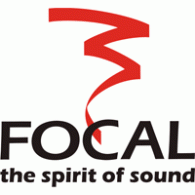
The previous logo in monochrome was refined in the following year by making the vertical ribbon-like element red. Though the design of the “FOCAL” logotype in black was retained, the tagline “the spirit of sound”, again in black, was made bolder with less spacing between the letters.
(2022 – Present)
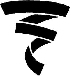
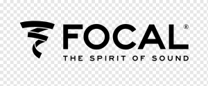
The latest logo came about in 2022, and it continues to this day. It features the thick vertical ribbon-like element in black, disjointed in various places. Alongside the graphical emblem appears the brand name and the tagline, both in black, written in two levels.
The Elements of the Focal Logo
Font
The wordmark that forms a part of the Focal logo is written in uppercase using a custom, bold, and geometric sans-serif typeface. The clean lines of the letterforms show precision and engineering excellence. The font is similar to Eurostile or Neo Sans and is mostly used for industrial tech branding, thanks to their sleek and contemporary appearance.
Colour
The Focal logo uses black, white, and grey as its primary colour palette. The colours are often accented with red or metallic silver. Here, black symbolises luxury, precision, and authority, while white conveys clarity and purity. Grey or metallic silver, on the other hand, symbolises craftsmanship, technology, and timelessness. The colour red evokes a sense of passion and energy.
Finally
The evolution of the Focal logo shows the journey of the company from a passionate French audio laboratory to a globally respected leader in high-fidelity sound. The logo evolved from its early days as JMlab, when it emphasised technical craftsmanship and founder identity, to its modern, minimalist form. The logo iterations reflect the brand’s growth, innovation, and international appeal.