GE Appliances, which is a subsidiary of the Haier Company, is one of the most trusted and long-standing home appliance manufacturers in the USA. It was founded as part of the General Electric Company and has played a major role in shaping modern household living through continuous innovation and advanced technology. Based in Louisville, Kentucky, GE Appliances produces a wide range of household products, which include refrigerators, dishwashers, washing machines, ovens, and air conditioners.
The GE Appliances logo is an enduring symbol of innovation, reliability, and American industrial heritage. Its evolution tracks the transformation of the appliance industry. The article delves into the various logo iterations of GE Appliances, among other details of the company.
The Genesis of the GE Appliances Logo (1978 – 1986)
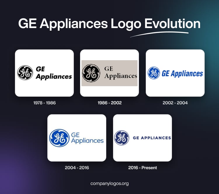
The original GE logo featured a “GE” monogram and a wordmark in monochrome. The monogram contained two intertwined cursive handcrafted letters “GE” in white within a round medallion with a black background. The design had decorative flourishes or swirls that resembled electric currents to symbolise the company’s connection to innovation, fluidity, motion, and electricity. The wordmarks “GE” and “Appliances” were written in two levels in bold italics to the right of the monogram.

(1986 – 2002)
The logo of 1986 retained the monogram but changed the wordmark to display straight and thin letter fonts.

(2002 – 2004)
The logo comprising the monogram and the wordmark underwent another iteration in 2002, wherein the monochrome palette of black and white gave way to blue and white. Further, the brand name “GE Appliances” was written with a right slant in a single line, unlike the two levels in the previous iterations.

(2004 – 2016)
The 2004 logo iteration retained the previous design but straightened and thinned the letter fonts.

(2016 – Present)
In 2016, GE sold its appliance division to the Chinese appliance company, Haier, but the iconic monogram logo was retained for continuity. To the right of the monogram was mentioned the wordmark “GE APPLIANCES” in deep blue uppercase using a clean, simple, and modern sans-serif typeface. The overall logo gave a sense of tradition, reliability, and professionalism.

The Elements of the GE Appliances Logo
Font
The monogram of the GE logo uses a cursive, script-style font for its initials “G” and “E”. It is characterised by flowing, elegant, interconnected letterforms. This cursive monogram is unique to GE and has remained virtually unchanged for over a century. Alongside the monogram, GE has used a proprietary clean, simple, and modern sans-serif typeface to execute the brand name for a contemporary and clean look.
Colour
The colour scheme of the GE Appliances logo features a rich blue background with white lettering and accents. The colour blue evokes reliability, trust, and professionalism. The white cursive letters of the monogram enhance readability and timeless elegance.
Finally
The basic design of the GE logo, especially the monogram, has remained virtually unchanged since the founding of the company. It symbolises both continuity and trust for generations of consumers. Even as GE Appliances changes corporate ownership and expands product lines, the logo stays at the heart of its brand identity. It is universally recognised in American homes and beyond.