Haier is arguably the leading brand in home appliances and smart home solutions worldwide. Founded in 1984 in Qingdao, China, the brand began as a fledgling manufacturer of refrigerators. However, over the years, it made a massive turnaround through strict enforcement of quality control. Also, the company embraced strategic acquisitions as a policy to achieve international expansion. Its forward-looking vision has led it to embrace the Internet of Things and turn ordinary home appliances into smart home solutions.
The Haier logo has undergone a significant evolution alongside the brand’s transformation from a struggling Chinese appliance factory into a global leader in home appliances and smart home ecosystems. The Haier logo history shows the broader corporate journey of the company marked by strategic shifts, modernisation, and increasing international influence. The article explores the various changes undertaken by the Haier logo, among other details of the company.
The Genesis of the Haier Logo (1984 – 1991)
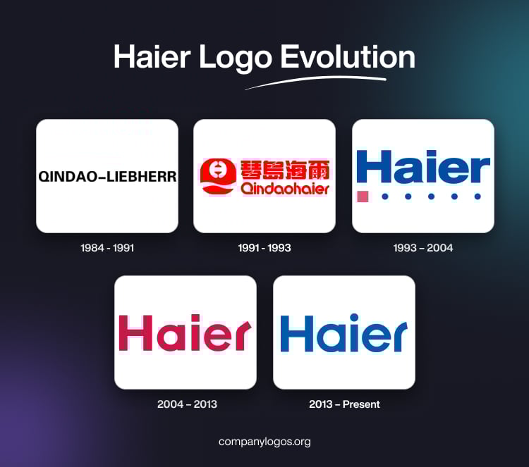
The original name of Haier was Qingdao Refrigerator Co., which became Qingdao-Liebherr in 1984 after a joint venture with the West German heavy equipment and appliance company, Liebherr. Thus, the original logo of the company was a combination of a graphical emblem and the wordmark “QINDAO-LIEBHERR” in bold, black, uppercase.
The circular emblem depicting the letter “Q” had a thick black outline and a slanted accent near the bottom. It contained thick intertwined letters “H” and “L” against a white background. The thicker letter “L” was placed at the centre of the stretched letter “H”, but appeared slightly below.


(1991 – 1993)
In 1991, the company changed its name to Qindaohaier. Here, “Haier” is derived by shortening the German name “Liebherr” to just the last two letters. The logo in red showed a graphical emblem and the wordmark in both Chinese and English. The graphical emblem was made of an abstract letter “Q”, where the upper part of “Q” looked like a bell.
Inside the bell shaped portion of the graphical emblem appeared a small white element comprising two small opening and closing parentheses joined in the middle. The lower portion of the letter “Q” in red was separated from the main part by a small white wavy strip.

(1993 – 2004)
The 1993 logo iteration saw the brand name “Haier” written in a bold and blue title case using a modern and distinct sans-serif typeface. Below the wordmark appeared a small crimson square accent followed by a sequence of smaller blue circles arranged in a line to convey a sense of digital connectivity. The overall logo conveyed a sleek image of a company known for its quality and innovation.

(2004 – 2013)
As Haier entered global markets and expanded abroad, it streamlined its visual identity. The 2004 logo version featured the brand name in red with a single-storey “a” and a more unified, bold, and energetic sans-serif typeface. Here, the letter “r” was curled at an angle to add a touch of uniqueness and dynamism.
This logo did not have any graphical element but a minimalist, clean, and straightforward presentation. Besides, the use of a single colour was striking and emphasised energy and confidence. It aligned with Haier’s vision of being a forward-looking brand in the appliance industry.

(2013 – Present)
The current logo was introduced in 2013, wherein the logotype was further refined by using a minimalist, clean, and modern sans-serif typeface in bold blue. Designed by Dongdao, the letter “r” was made smoother, and “i” was given a circular dot instead of the square one in the previous iterations. The deep blue colour of the logotype symbolises reliability and professionalism.

(2019) (35th Anniversary Logo)
The 35th anniversary logo was introduced in 2019, where the present logotype was accompanied by the numerals “35th” in a bigger size. The logotype in white was set against a light purple background and was followed below by the tagline “1984-2019”.

The Elements of the Haier Logo
Font
The wordmark used in the Haier logo is written using a clean, modern, and slightly rounded sans-serif typeface. It appears similar to ITC Avant Garde Demi Bold and presents a circular dot above the letter “i” to probably convey global presence or precision. Also, the letter “r” is made smoother and more streamlined with a distinctive cut.
Colour
The Haier logo is designed using a saturated blue shade against a white background to convey depth and stability in the evolution of the brand.
Finally
The Haier logo iterations show the journey of the company from a fledgling regional manufacturer to a global leader offering smart home solutions. The logo evolution reflects a strategy of modernisation, international expansion, and an increasing emphasis on digital connectivity and consumer experience. It is a testament to Haier’s ability to adapt its visual identity to each phase of its corporate growth while maintaining continuity and brand equity throughout its history.