Electrolux AB is a leading Sweden-based multinational company that produces home appliances. Recognised globally for its innovative and reliable products, Electrolux was founded in 1919 through the merger of Lux AB and Svenska Elektron AB. The wide product portfolio of Electrolux includes refrigerators, washing machines, ovens, vacuum cleaners, and small kitchen appliances. The company operates in more than 150 countries and is known for combining Scandinavian design principles with advanced technology.
The Electrolux logo has undergone several changes since its inception, and each of these logo iterations reflects the growth of the company from a Swedish vacuum cleaner manufacturer to a global home appliance leader. The article explores the evolution of the Electrolux logo over the years, among other details of the company.
The Genesis of the Electrolux Logo (1919 – 1920)
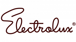
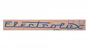
The original Electrolux logo was a handwritten inscription depicting the brand name. It was written in cursive style without any line breaks, where each letter was connected to the subsequent one. Written in dark brown colour, the inscription had a lot of loose twists, especially with the letters “E”, “l”, and “t”.
(1920 – 1922)
The 1920 logo iteration featured the brand name written in a metallic-looking, bold, geometric sans-serif typeface in uppercase against a red horizontal rectangular background.
(1922 – 1924)
The 1922 logo variant featured a more uniform, yet italicised, cursive-styled inscription in a title case. The yellow-coloured lettering was placed against a dark blue rectangular background. A few letters of the logotype had curved and elongated lines, such as “E”, “t”, and “x”.
(1924 – 1926)
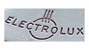
In 1924, the Electrolux logo in brown featured a graphical emblem along with the brand name. Consisting of a circle, the emblem at the centre had three even stripes drawn vertically at the top. The uppercase lettering was executed in a curved sans-serif typeface.
(1926 – 1928)
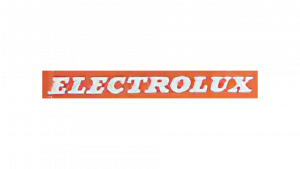
The 1926 logo variant appeared in a white printed inscription in uppercase written using a classic serif typeface. The lettering was placed on a horizontal red rectangle.
(1928 – 1934)
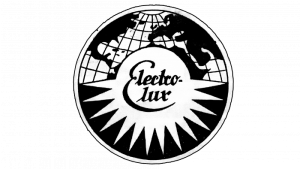
The 1928 logo consisted of a black-and-white circle with a thin black and white outline. The upper part of the circle featured a portion of the world map along with the grid. The centre and lower portions of the circle had the brand name written on two levels using a cursive typeface in black. The brand name was set against a small circle resembling the sun in white with protruding rays, also in white, spread in different directions.
(1934 – 1939)
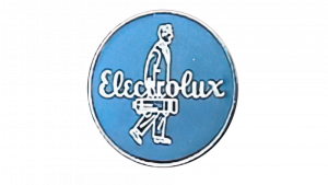
The 1934 logo featured a blue circular emblem with two white elements. One of the white elements was the stylised image of a buyer drawn sideways carrying a vacuum cleaner from right to left. The other element in white was the brand name “Electrolux” written in cursive letters in italics.
(1939 – 1941)
The next logo iteration in 1939 saw the brand name in uppercase written using a bold serif typeface in white. Each letter of the brand name had adequate spacing, and the brand name was surrounded by a white stretched rectangle with a convex top and bottom. Further, both the lettering and the white outline were placed inside a blue rectangle.
(1941 – 1947)
The 1941 logotype in blue was written in a title case, and each letter was joined together at the base by a single line. Also, the horizontal bar of the letter “t” and the upper crossbar of the letter “x” were extended. The background of the logo was light brown.
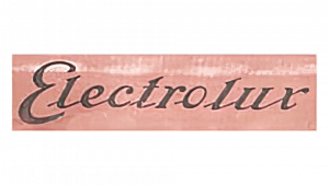
(1947 – 1954)
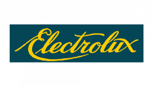
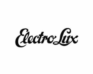
The 1947 logo comprised a brown cursive wordmark with delineated letters. Most letters stood separately from each other, except for the interconnectedness of “lec” and “lux”. Besides, the letters “t” and “l” had pointed tops.
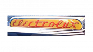
(1954 – 1957)
The 1954 logo saw a rounded handwritten inscription in red where every letter was joined at the bottom through the curves. Also, there was a small red square dot on top of the letter “x”.
(1957 – 1962)
In this logo iteration, the previous logo was repeated, except for the fact that the inscription was made more linear and slanted and included a shared line at the bottom. However, the red inscription was placed in a horizontally stretched oval in yellow.
(1919 – 1962)
This visual identity introduced a new logotype where the brand name in black and set against a white background was split into two parts – capitalised “E” and “L”. The logotype was written using a smooth typeface with curved lines and softened angles.
(1962 – 1990)
The 1962 logo came with a graphical emblem and a wordmark in black and white. The emblem consisted of a bold black square containing a white circle inside. Inside the circle was placed a stylised image of a three-pointed star. The wordmark below the emblem was written in a title case using a thin traditional serif typeface. Interestingly, the graphical emblem became a part of the subsequent logo editions as well.

(1990 – 2015)
The 1990 logo saw the logo elements being swapped and changed in scale. For instance, the graphical emblem, as depicted in the previous iteration, was made smaller, while the brand name was enlarged by adding serifs.

(2011 – 2015)
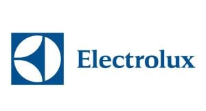
In this iteration, the scale of the graphical emblem was increased at the cost of the wordmark. The logo in blue had the wordmark written in a classy serif typeface with sharp ends.
(2015 – Present)
The present logo retains the previous one and features the brand name in a new, modern and custom typeface called the Electrolux Sans. The typeface appears in Semibold, Regular, and Light variants. Besides, the stylish letters of the brand name had rounded angles and the wordmark was either placed to the right or bottom of the emblem.


The Elements of the Electrolux Logo
Font
The logotype used in the Electrolux logo is written using a custom typeface called Electrolux Sans, which has been modified from the Hurme Geometric Sans No 2 typeface. The logo appears in three font variants – regular, light, and bold.
Colour
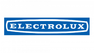
The Electrolux logo is depicted in two colours – navy blue and white.
Finally
The evolution of the Electrolux logo shows how the company grew to attain its status as a modern, globally recognised brand. The logo chain started with ornate and script-style marks in the early 20th century and gradually simplified its identity to match the changing design sensibilities of each era. The most defining moment came in 1961–62, when Swiss designer Carlo L. Vivarelli introduced the bold circular emblem.
It was a timeless, geometric design that symbolised motion, innovation, and modernity. This mark became the cornerstone of Electrolux’s visual identity and provided consistency and recognition across decades of expansion and diversification. The Electrolux logo stands as a perfect example of how a company can evolve its visual identity by balancing tradition with innovation.