Visa is arguably one of the most popular payment systems in the world. Established in 1958 in California, USA, Visa facilitates electronic funds transfers throughout the world, notably through its debit and credit card products. With operations spanning over 200 countries and territories, Visa has established itself as a leader in the financial services industry.
A key contributor to the success of the company has been its iconic logo, which has evolved over the years to keep pace with changing consumer preferences and technological advancements. In fact, the Visa logo has played a crucial role in consolidating its status as a trusted brand worldwide. The article traces the journey and evolution of the Visa logo over the years.
The Genesis of the Visa Logo (1958 – 1976)
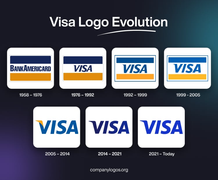
The origins of Visa can be traced back to 1958, when the Bank of America introduced the BankAmericard. It was the first widely distributed credit card programme in the world. The original BankAmericard logo featured a rectangular badge with rounded corners. It enclosed the wordmark “BANKAMERICARD” in bold, uppercase letters in a blue sans-serif typeface. The wordmark was placed on a white band located at the centre of the rectangular badge. The white band had a blue band above it and a yellow band below it. Interestingly, the letters “A” and “B” appeared taller than the rest of the letters in the wordmark. The simplicity of this design reflected the pioneering nature of the product and set the stage for future iterations.

(1976 – 1992)
In 1976, BankAmericard underwent a major rebranding exercise. Consequently, it adopted the name “Visa” to expand globally and to ensure ease of pronunciation across multiple languages. This transformative move marked the beginning of the international expansion of the company and a shift towards a more universal brand identity. And as a consequence to the rebranding exercise of the company, the logo was redesigned as well.
The new Visa logo retained the earlier rectangular shape but replaced the “BankAmeriCard” with the wordmark “Visa” in a bold, sans-serif typeface. Although the original colours of the logo were retained, the wordmark “Visa” was rendered in italics, and the slant of the letter “V” was emphasised more. This design effectively conveyed a sense of modernity and dynamism. At the same time, it maintained the popular visual identity of the brand.

(1992 – 1999)
With the advent of the 1990s, the Visa logo underwent a subtle yet significant transformation. The colour scheme was made lighter, and the once-vibrant blue colour was changed to a softer and more approachable shade. This change reflected the desire of the brand to project a friendlier and more accessible image. The letters of the wordmark “Visa” were made bigger, and the contours were further refined.
Additionally, the shape of the logo was slightly modified, and the overall proportions were made more streamlined. These refinements resulted in a cleaner and more contemporary aesthetic. Besides, the logo had an increased emphasis on minimalism.

(1999 – 2005)
Entering the new millennium, Visa embraced a more modern and sophisticated look for its logo. The most notable change was the increased spacing between the individual letters in the wordmark. It, thus, created a more open and airy composition. This adjustment enhanced legibility and gave a sense of confidence and stability to the visual identity of the brand.
Furthermore, the colour scheme underwent another shift, wherein the blue colour was changed to a richer and more authoritative tone. This alteration reinforced the position of Visa as a leader in the financial services sector.

(2005 – 2014)
In 2005, Visa unveiled a refreshed logo design to drive home the point that it needed to showcase its various financial services. The thought behind the logo redesign was to do away with the credit card design. The most striking change was the removal of the rectangular badge or logo frame and the use of the wordmark “VISA” as the sole focal point. This simplified approach allowed the brand to achieve a more impactful and recognisable presence across various applications and mediums.
The wordmark itself received a subtle modification, with the letter “V” being slightly taller and more pronounced. Additionally, a golden “flick” or accent was added to the top of the letter “V” to introduce a sense of dynamism and energy into the design. The colour palette was also refined, wherein a deeper shade of blue was complemented by a warm, metallic gold accent.

(2014 – 2021)
In this logo iteration, the golden accent on the letter “V” was removed, and, in its place, a gradient shade of blue was added. Interestingly, the golden accent of the previous logo iteration represented the hills of California, while the blue colour of this iteration highlighted the blue skies of California. It appears the golden accent was removed to make the brand more approachable and accessible. This was due to the fact that gold signified luxury and prestige that were supposedly perceived to be unattainable. On the other hand, a gradient of blue made the card to appear accessible across the world.

(2021 – Today)
In 2021, the logo was made more traditional by removing the gradient and changing the colour palette of the whole wordmark to a lighter shade of blue, namely, royal blue.

The Elements of the Visa Logo
Font
The Visa logo features the wordmark “VISA” in bold and a slightly italicised sans-serif typeface. The letters in the wordmark resemble the dT Ampla Bold Italic typeface and have modifications that set them apart. The left stem of the letter “V” is elongated and sharpened to give it a dynamic and assertive quality. At the same time, the upper-left corner of the letter “A” is softened, and the overall sharp edges are tempered.
Colour
The visual identity of Visa is offered by a vibrant and deep shade of blue. This particular shade exudes energy, progression, and a sense of motion. This striking colour instills confidence and trustworthiness. The seamless integration of these carefully thought-out elements (fonts and colours) has resulted in a visual language that is both impactful and instantly recognizable. The Visa logo brilliantly encapsulates the core values of dynamism, confidence, and trustworthiness.
Finally
The Visa logo reflects the growth, adaptability, and commitment of the company to stay relevant in an ever-changing business landscape. In fact, the Visa logo has played a crucial role in establishing and reinforcing the brand identity of the company as a powerhouse of global payments.
The logo iterations have kept pace with design trends and have effectively communicated the values and positioning of Visa at different stages of its development. So, whether projecting a sense of pioneering spirit, modernity, reliability, or global reach, the Visa logo has consistently resonated with consumers the world over.