The iconic lemon-lime-flavoured soft drink, Sprite, has been quenching thirsts around the world since its introduction in 1961. Over the decades, the brand has not only evolved its beverage offerings but has also undergone significant changes in its visual identity. This article explores the fascinating evolution of the Sprite logo and traces the changes through different timelines, among other details of the company.
The Genesis of the Sprite Logo (1960 – 1961)
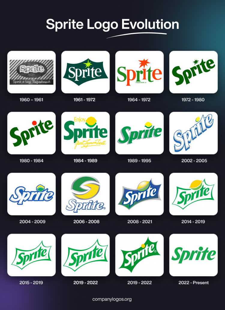
Designed by Lippincott & Margulies, the original Sprite logo featured the brand name in a custom typeface in black lowercase, where the letters were placed unevenly. The brand name is set against a white silhouette of letters, which is further placed inside a black oval. The whole logo’s elements were placed inside a large rectangle with black and white patterns and a black banner at the bottom. The handwritten tagline “Spark-a-ling Refreshments” in white is featured below on the black banner.
(1961 – 1972)
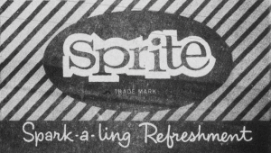
The 1961 logo featured a playful and straightforward design with the word “Sprite” written in a distinctive cursive font. The focus was on the lemon and lime imagery that reflected the key flavours of the beverage. During this period, the brand aimed to establish itself as a crisp and citrusy soda option. The jagged, white letters against a dark green background formed the word “Sprite,” and the long serifs added dynamism.
Additionally, in place of the dot above the “i,” an eight-pointed lime shining green star was introduced. This encapsulated the crisp, refreshing taste of the soda. The star evoked bubbles rising in a fizzy glass. Together, the elements combined to create an unforgettable and innovative logo befitting the Sprite brand.
(1964 – 1972)
The year 1964 saw the colour of the wordmark and the star above being changed to red and grass-green. Interestingly, half of the letters sported one colour, while the other sported another. The star above the letter “I” became red while the letter itself got a serif atop the vertical bar.

(1972 – 1980)
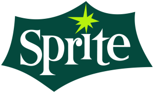
The 1972 logo featured the brand name written along a tangent in dark green colour. The letters forming the brand name had rounded shapes, while a much smaller star above the letter “i” appeared in a dark green shade as well.
(1980 – 1984)
In 1980, the logo underwent a significant redesign, and introduced a bold and stylized logotype in a dark green colour palette. Also, the colour of the star above the letter “I” was changed to a red dot. This era marked a shift towards a more contemporary visual identity that aligned with the evolving design trends of the time.
(1984 – 1989)
In the year 1984, the lemon symbol was introduced in place of the red dot and the words “Enjoy” and “Great Lymon Taste” in yellow were added to the top and bottom of the wordmark. The styling of the letters changed with “i” and “t” appeared seemingly different from their previous avatar.

(1989 – 1995)
With the advent of the new millennium, Sprite decided to add a three-dimensional twist to its logo. The logo was redesigned by adding edgier graphics and the words “Great Lymon Taste” were removed. The logotype with serifs gained depth and dimension, and gave the impression that the brand was literally popping off the shelves. The lemon and lime visuals continued to evolve, and became sleeker and more stylized. This period highlighted Sprite’s commitment to staying current and engaging with a younger and trend-focused audience.
(2002 – 2005)
The year 2002 saw the logo font being changed for use outside North America. The wordmark “Sprite” appeared at an angle in white with thick blue shadows and outline. The image of the lemon above the letter “i” also changed in dimension.
(2004 – 2009)
The previous logo design was retained in this iteration, and the lemon motif above the letter “i” was enlarged such that both yellow and green elements were made of the same size.
(2006 – 2008)
The year 2006 saw the lemon motif grow bigger than the wordmark below. Resembling two interlocking semicircles in green and yellow with thick grey and silver outlines, the lemon motif was placed above a much smaller wordmark in white having serifs but with a thin blue outline.
(2008 – 2021)
In 2008, the logo was redesigned with changes made to the font. A silver border was added to the logo, which was reminiscent of the 1961 logo design. The letters of the wordmark were executed at an angle in white with a thick blue outline. The wordmark was placed against an abstract-shaped background in blue and green with a gradient and a thick grey outline. A big lemon-shaped element was placed above the letters “r”, “i”, and “t”.
(2014 – 2019)
The design of the above logo was retained, but the colour scheme and size were changed. For instance, the blue and green coloured abstract-shaped background of the previous logo was replaced with white. Also, the colour scheme of the wordmark and the outline of the abstract background were changed to green.
(2015 – 2019)
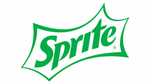
In recent years, there has been a global design trend favouring simplicity and minimalism. Consequently, the 2018 logo iteration saw the logotype become cleaner, with a focus on simplicity and legibility. The lemon motif was removed, and the outline of the abstract background and the wordmark were made thicker. This minimalist approach aimed to communicate freshness and clarity. It perfectly aligned with the brand’s commitment to natural ingredients.
(2019 – 2022)
The previous year’s logo design was repeated, but the green colour of the wordmark and the outline of the abstract background was made a shade lighter.
(2019 – 2022)
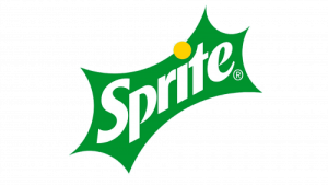
Another logo to appear in 2019 saw the slanted wordmark in white set against a dark green background. Also, a small yellow circle featured atop the letter “i” as a reference to lemon, the main ingredient.
(2022 – Present)
In May 2022, Sprite underwent a significant rebranding exercise. The iconic cursive and slanted “Sprite” wordmark was simplified and made to appear straight. Also, the signature border was stripped off to create a clean and modern look. The yellow circle atop the letter “i” turned green, like the colour of the letters.

The Elements of the Sprite Logo
Font
The latest Sprite logo sports a new, sleek sans-serif font. The angled lettering has softened edges and thick strokes.
Colour
Green has been intrinsically linked to Sprite since 1961, like Fanta is to orange and Coca-Cola is to red. This cemented its association with lemon-lime soda in consumers’ minds. The 1974 update refreshed the logo for a new decade and retained the colour that makes Sprite instantly recognisable.
Finally
The evolution of the Sprite logo reflects the changing aesthetics of design as well as the brand’s journey in staying relevant and resonating with consumers across generations. The logo had humble beginnings in the 1960s and has evolved to the sleek and minimalist design of today. The Sprite logo has adapted to the ever-shifting landscape of consumer preferences.