Sharp is a world-renowned Japanese company that manufactures a host of products, such as solar panels, televisions, monitors, microwaves, phones, and calculators. Based in Sakai, the company was founded in 1912 by Tokuji Hayakawa.
The Sharp logo has undergone several evolutions since the inception of the company. It echoes the company’s origins and its journey to becoming a global electronics giant. Interestingly, the name and corporate symbol trace back to the invention of the “Ever-Ready Sharp Pencil”. The article delves into the various logo iterations of Sharp, among other details.
The Genesis of the Sharp Logo (1912 – 1952)
The original logo featured the brand name in red written in a calligraphic script where the letter “S” had an extended arm that stretched over “h” and “a” to finish over “r”. The upward glyph of the letter “r” was also extended upwards as a nod to the sharp pencil. The logotype was underlined to signify its special status and market position.
(1952 – 1969)
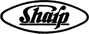
The subsequent Sharp logo refined the earlier wordmark and rendered it in black against a white background. The letters of the wordmark were made compact and surrounded by an oval with a thick black outline.
(1965 – 1968)
In the logo iteration of 1965, the oval was discontinued, and the logo featured the brand name in black uppercase against a white background. The letters forming the wordmark had sharp cuts and thick edges. The top of the letter “A” was flattened, while the letters “S” and “R” had unique shapes.

(1968 – 1969)
The logo iteration of 1968 saw the letters of the wordmark flattened and rendered in a modern geometric sans-serif typeface. The letter “S” was straightened a bit, while the middle bar of the letter “R” was extended.

(1969 – 1980)
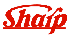
In 1969 the colour of the logo was changed to red, and the glyphs of the wordmark rendered in a custom sans-serif typeface were made sharper.

(1980 – 1990)
The 1980 logo more or less retained the previous iteration with subtle changes in the proportions and spacing of the glyphs.

(1990 – Present)
The logo of 1990 continues with its distinctive, geometric sans-serif font and vivid red. The open glyph of the letter “R” points out the fact that the company is open to new developments and develops market-centric products.

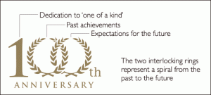
(2012) (100th Anniversary Logo)
In 2012, a special commemorative logo was introduced for Sharp’s 100th anniversary. It featured intertwined rings symbolising the company’s evolution from past to future. The accompanying wordmark was written using a modern sans-serif typeface.
The Elements of the Sharp Logo
Font
The wordmark used in the Sharp logo is rendered using a custom geometric sans-serif font. The font was created expressly for Sharp’s brand needs, and it conveys a sense of clarity, intelligence, and contemporary appeal. The letters of the logo appear to be stretched horizontally and flattened. Also, the top of the letter “A” is shown to be flattened, while the letters “R”, “P”, and “S” have curves.
Colour
The Sharp logo employs “Sharp Red” as its colour. This vibrant red hue conveys energy, reliability, and creative spirit.
Finally
The Sharp logo has evolved over the years to become an internationally recognised design. Each change in the logo reflects milestones in the company’s history, whether conducting breakthrough inventions or expanding globally. Each logo iteration is anchored by a bold typographic and colour identity that communicates Sharp’s ongoing commitment to innovation and clarity.