Shure is a world-renowned audio company, which was founded in 1925 by Sidney N. Shure in Chicago. The company started its journey as a mail-order radio parts supplier before evolving into one of the most influential names in professional and consumer audio. Shure is best known for its legendary microphones, including the iconic Unidyne Model 55, the SM57, and the SM58.
These have become industry standards on stages, in studios, and at presidential podiums. Shure’s visual identity has undergone several changes since its inception. The article delves into the various logo changes undertaken by Shure, among other details of the company.
The Genesis of the Shure Logo (1925 – 1928)
The original logo in dark brown colour featured the wordmark “SHURE RADIO” in a bold custom serif typeface surrounded by a zigzag pattern of lines resembling sound waves. At the centre were three concentric circles in thick brown outlines, with the wordmark “COMPANY” arched below. The size of the individual letters of the “SHURE” wordmark decreased from the first letter, “S”. On the other hand, the size of the individual letters of the wordmark “RADIO” increased from the letter “R”.

(1928 – 1936)
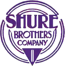
The company became “SHURE BROTHERS COMPANY” after Samuel J. Shure joined his brother Sidney N. Shure. The logo of the time represented the new name surrounded by double outlines of two concentric circles. Designed in deep purple, the bottom of the circles saw a solid inverted arrow with two thin vertical lines in white. The name of the company was mentioned at three levels in decreasing thickness and size. In the wordmark “SHURE”, the horizontal bars in the letters “H” and “E” were at the top.
(1936 – Present)
The most significant development in Shure’s logo history occurred in 1936 with the introduction of the iconic Circle S trademark. This distinctive logo featured a circular design with white-coloured sound waves on the left against a black background, a black voice coil on the right against a white background, and the Shure “S” or sine wave in the middle. The ingenious design worked bidirectionally – reading from left to right represented a microphone (sound waves into voice coil), while reading from right to left represented an earphone.

(1936 – 1941)
The 1936 logo edition featured the wordmark “SHURE BROTHERS” in white, but with green outlines and shadows. The previous circle S emblem in green and white was placed below.

(1941 – 1943)
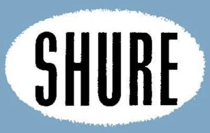
The 1941 logo featured the large wordmark “SHURE” in thick black set against a white oval. The two elements were placed inside a rectangle of light teal colour.
(1943 – 1957)
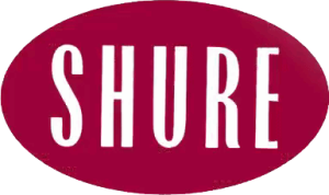
The 1943 logo edition saw the large wordmark “SHURE” in white placed against a solid oval in maroon colour.
(1957 – 1970)
In 1957, the “SHURE” wordmark in white was stretched and flattened along the sides and placed against a solid green rectangle.

(1970 – 1973)
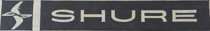
The 1970 logo iteration saw the brand name in an off-white colour placed against a dark brown horizontally oriented rectangle. The left of the rectangle contained an abstract emblem in an off-white colour and was separated from the wordmark by a thin band. The emblem appeared to be a combination of a thick vertical streak resembling the letter “S” and a horizontal sinusoidal wave – all in off-white.
(1973 – 1982)
The 1973 logo variant retained the design and elements of the previous logo, but not the colour scheme. So, the emblem and the wordmark were displayed in white colour, while the background was changed to black.

(1982 – 1985)
The 1982 logo iteration saw the brand name in red written in a thick block-like typeface where the right arm of the letter “R” touched the bottom left of the letter “E”.

(1985 – 2000)
The previous styling of the brand name in blue was brought back again in 1985, but with a left slant.

(2000 – 2007)
The year 2000 logo featured the brand name in three dimensions, thanks to the grey colour scheme with a gradient.

(2007 – Present)
The 2007 logo was a replica of the previous logo but was rendered in two dimensions and in a black colour scheme. It was accompanied by the circle S emblem, where the letter “S” in white was placed inside a black circle at the centre. The circle was further placed inside a bigger black circle with a thick pattern of horizontal and vertical lines in white.

(2019 – Present)
Designed by FutureBrand, the current logo was introduced in 2019. It features the logotype “SHURE” in an electric green colour.

The Elements of the Shure Logo
Font
The wordmark of the Shure logo is written using a custom, bold, sans-serif typeface. The letters of the logo were italicised to convey progress, motion, and innovation. The use of the typography reflects Shure’s identity as that of a modern, innovative, and durable audio technology company.
Colour
The colour palette of the Shure logo is bright lime green, aka Shure Green or Ignition Green. The colour symbolises creativity, energy, and innovation and reinforces the role of Shure in powering music and sound.
Finally
The evolution of the Shure logo reflects the company’s journey from a small radio parts distributor to a leader in global audio technology. Shure has maintained one of the most recognisable identities in professional audio while adapting to changing market demands and technological advances. The logo’s enduring design principles continue to serve the company as it moves into its second century of audio innovation.