ARB is said to be the biggest manufacturer of 4 x 4 vehicle accessories in Australia. Founded in 1975 by Tony Brown, the company aims to provide the most reliable gear for off-road vehicles to 4 x 4 enthusiasts. Thanks to the durability and superior quality of equipment, the products of the company have gained the credibility of users. ARB boasts a logo that is instantly recognisable for off-road enthusiasts not only in Australia but elsewhere as well. The article delves into the history of the ARB logo and traces its evolution alongside the rise of the company to prominence.
The Genesis of the ARB 4 x 4 Accessories Logo (1975 – 1986)
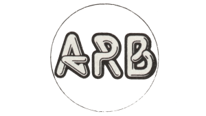
The story of ARB begins in 1975, when the founder, Tony Brown, got frustrated by the lack of quality 4 x 4 equipment during an outback adventure. Thereafter, Tony Brown started fabricating roof racks back in his Melbourne garage by etching his initials, “ARB” or Anthony Ronald Brown, onto each piece. However, these early logos did not have any standardised design and showed the early stage of the company’s development.
One iteration featured the wordmark “ARB” enclosed in a black thin circular outline. Here, the colour of the initials appears to be light beige or off-white. Also, the glyphs of the letters appeared to have a styling of their own and there seemed to be an interplay of individual letters. The early logo designs hinted at the future direction of the company but did not possess the cohesion and strength to become the ARB hallmark.
(1986 – Present)
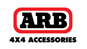
The year 1986 marked a turning point for the ARB logo. In that year, the bold and black wordmark “ARB” was enclosed within a red rectangle with rounded corners. Here, the thick red outline of the rectangle provided a strong contrast against the white background to symbolise power and resilience. The typeface displayed was heavy serif, wherein the lower serifs of the letters overlapped and the glyphs merged together. These created a sense of unity, continuity, and solidity.
Below the rectangle, a separate sans-serif typeface spelled out “4×4 ACCESSORIES” in a clearer and more functional style. And unlike the initials above, the glyphs herein were not connected to each other. This two-tiered approach offered a clear brand identity and gave a functional description of the offerings of the company.
The Elements of the ARB 4 x 4 Accessories Logo
Font
The wordmark stating the initials of the founder, “ARB,” is executed in black and using a heavy serif typeface with glyphs merged with each other. On the other hand, the wordmark “4 x 4 ACCESSORIES” is written in a simple and light serif font. Here, the font resembles the Limerick Serial Heavy of SoftMaker or Raiderfont Regular of the Sharkshock family.
Colour
The colour palette of the ARB logo includes red, white, and black. Here, the colour red likely symbolises the ruggedness of the Australian landscape, and the colour black symbolises durability and strength.
Finally
The evolution of the logo of ARB 4 x 4 Accessories reflects the journey of the company from a local Melbourne business to a global leader in 4 x 4 accessories. Over the years, the logo has maintained a strong and bold presence, much like the products ARB is known for. The consistent use of red in recent decades has helped establish a powerful brand identity, which is easily recognisable in the competitive market of the automobile industry.