Anchorage Digital is a digital asset platform and federally chartered crypto bank that provides secure, regulated infrastructure for institutional investors. It was founded in 2017 by security engineers Diogo Mónica and Nathan McCauley. The company offers a full suite of services, which includes custody, trading, settlement, staking, and governance. Anchorage Digital has positioned itself as a trusted bridge between traditional finance and the rapidly evolving world of blockchain technology.
The logo of Anchorage Digital has evolved as the company moved from a crypto security startup into a regulated, institutional-grade digital-asset platform and (later) a federally chartered crypto bank. The article delves into the evolution of the two logos, among other details of the company.
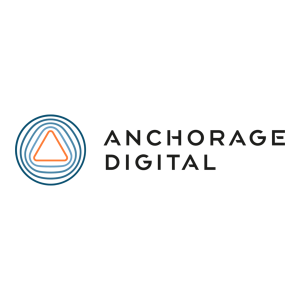
The Genesis of the Anchorage Digital Logo (2017 – 2022)
The original Anchorage logo comprised a simple emblem and the brand name written in a clean sans-serif typeface. The graphical emblem emphasised security and institutional trust rather than bold consumer branding. It comprised a sequence of concentric abstract circles that took the shape of the triangular element at the centre with rounded corners.
The dual-coloured emblem had the triangle at the centre in orange, while the concentric figures were in blue. The wordmarks “ANCHORAGE” and “DIGITAL” in blue uppercase were placed in two levels to the right of the abstract emblem.
(2022 – Present)
To mark its fifth anniversary and global expansion (including a new engineering hub in Porto), Anchorage unveiled a new visual identity in late 2022. The new mark that continues to date is a stylised, abstract geometric emblem composed of four discrete blocks.
The emblem is paired with the lowercase wordmark “anchorage digital” set in a clean geometric sans-serif typeface. The four-block emblem represents the core tenets of the company: industry-leading security, regulatory leadership, custody as a foundation, and commitment to clients.

The Elements of the Anchorage Digital Logo
Font
The wordmark in the current logo is written in lowercase using a geometric sans-serif typeface to convey modernity, approachability, and technical clarity.
Colour
The four-block anchor logo and the wordmark are depicted in a high-contrast black and white colour combination.
Finally
The evolution of the Anchorage Digital logo shows the transformation of the company from a pioneering crypto custody startup into a federally regulated digital asset bank with global reach. Its modern four-block anchor emblem, introduced in 2022, symbolises stability, security, and institutional strength. The logo’s journey demonstrates a design progression as well as the company’s growth and credibility. It reinforces an enduring commitment to providing secure, compliant infrastructure for the future of finance.