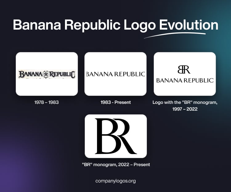
Established in 1978, Banana Republic is a popular US-based high-end apparel and accessory brand. Initially, the company was known as Banana Republic Travel and Safari Clothing Company. It was later changed to Banana Republic after being acquired by Gap. Just as a brand has changed over time, so too has its visual identity.
This article explores the fascinating origins and development of the Banana Republic emblem. It traces the origins of the brand, from a clothing business with safari-inspired designs to a worldwide fashion icon, among other details.
The Genesis of the Banana Republic Logo (1978 – 1983)
The logo of Banana Republic originally captured the essence of exploration and adventure. The original design had a hand-drawn style that emphasised the creators’ individuality and the brand’s dedication to genuineness. The logo featured the brand name written using a contoured and fancy old-style uppercase typeface.
The black lettering had grey shadows, which made them appear three-dimensional. At the centre of the brand name was placed an emblem made of a cool star comprising five banana-shaped strokes. The stylish first and last letters of the brand name were bigger than the rest.

(1983 – Present)
The latest logotype in black and set against a white background is minimalist. It is written using a thin and light serif typeface. The serifs of the letters are sharp and can be compared with the thorns on a rose. The overall logo looks distinctive and elegant, and the serifs represent the brand’s approach to style.

(1997 – 2022)
The 1997 logo comprised an emblem or monogram and a logotype in monochrome. The emblem was made by combining the letters “B” and “R” where “B” was reversed. Underneath the emblem was written the brand name using a serif typeface similar to the previous one.

(2022 – Present)
In 2022, the “BR” monogram was changed, while the logotype was retained. The thick letters “B” and “R” with sharp serifs were placed together and the vertical bar of “R” was removed. In fact, the letter “R” appeared to be an extension of the letter “B” and enveloped it in a cosy embrace.

The Elements of the Banana Republic Logo
Font
The wordmark of the Banana Republic logo is written in a sans-serif typeface, which bears a striking resemblance to the Seta Reta NF Regular typeface. Besides, TFArrow-Medium also shares some similarities, particularly in certain glyphs.
Colour
The colour palette of the Banana Republic logo is black and white, where black represents the brand name, while white acts as the background. The colour choice is to enhance legibility and to make the logo instantly recognisable amidst competition.
Finally
The evolution of the Banana Republic logo reflects the transition of the company from a specialised merchant with a safari motif to a well-known figure in the fashion world. Each logo version captures the dedication of Banana Republic to remain current while maintaining its unique personality.