Gorenje is a Slovakia-based manufacturer of household appliances. Its varied product portfolio includes refrigerators, kitchen appliances, dishwashers, washing machines, and small appliances used for both domestic and commercial use. The company is also into manufacturing furniture and ceramics that are used in bathrooms and kitchens. With a foothold in more than 90 countries, the brand maintains a strong focus on the European market.
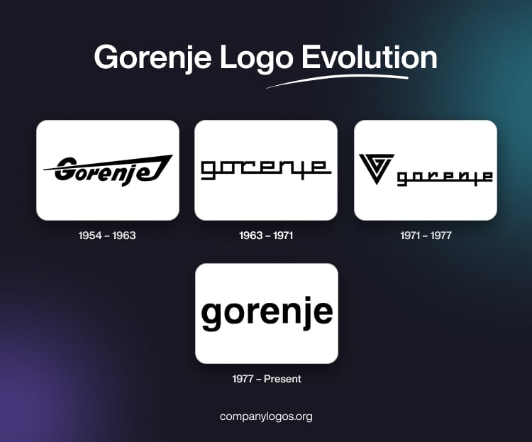
The Gorenje logo has evolved significantly since the company’s founding in 1950. The logo iterations show the growth of the company from a local manufacturer to an international brand. The logo has undergone four major changes, where each marks a new era for the company. Its current minimalist wordmark was introduced in 1977 and is still in use today. The article delves into the evolution of the Gorenje logo over the years, among other details about the company.
The Genesis of the Gorenje Logo (1954 – 1963)
The very first logo of Gorenje was introduced in 1954, a few years after its founding. This original logo, which was in use until 1963, represented the company’s initial phase as a small manufacturer producing agricultural machinery, just as it started to expand into household appliances. It showed the brand name in black placed at an angle with the last letter “e” extended to form a flame-inspired glyph.

(1963 – 1971)
The second logo was adopted in 1963, and it reflected a period of diversification and modernisation. By this time, Gorenje had begun producing solid-fuel cookers and washing machines, and the logo update matched its ambition to be seen as a more modern appliance manufacturer. The logo in black against a white background featured a digital touch where each glyph seemed to have flown into the next letter to create a dynamic effect. Depicting the letters to be in motion, the logo was less legible, especially when it came to the merging of the letters “r” and “e”.

(1971 – 1977)
From 1971, the company used its third logo by introducing a stylised upended triangular emblem to the already existing logotype. The wordmark written using a grotesque typeface was made smaller. Also, the glyph in the letter “g” was extended to the last letter “e”. The logo elements were depicted in black.

(1977 – Present)
The fourth and current logo was introduced in 1977, and it has continued to represent the company for nearly five decades. It is characterised by its simple, clean text mark “gorenje” in lowercase letters without serifs. There is no unnecessary graphic element either, unlike the previous logo.
This consistency in branding has helped Gorenje to remain recognisable over vast economic and technological changes. It also withstood other changes, such as multiple expansions and the acquisition of the company by Hisense in 2018.

The Elements of the Gorenje Logo
Font
The wordmark forming the Gorenje logo is written using a classic bold sans-serif typeface with smooth contours. The spacious characters of the wordmark improve readability and create a cohesive image.
Colour
The logo is in black monochrome, which reflects professionalism. Besides, it contrasts well with the white background for better readability.
Finally
The evolution of the Gorenje logo shows the strategic shifts made by the company. These include starting from its roots in postwar Yugoslavia to becoming a strong, pan-European brand. The longevity of the current logo reflects the company’s steady identity and its adaptability to changing markets and ownership structures.