Skip to content
Home » Famous logos » The History and Evolution of the China Unicom Logo

The History and Evolution of the China Unicom Logo

China Unicom Logo Evolution

China Unicom is one of the largest state-owned telecommunications providers in China and a Fortune Global 500 company. Founded in 1994, it serves hundreds of millions of users across mobile, broadband, cloud, and IoT. Further, it is a pioneer in 3G, 4G, and 5G networks. The China Unicom logo is one of the most distinctive and culturally inspired corporate emblems in the global telecommunications industry.

At its core is the iconic “endless knot”, which is a traditional Chinese symbol of eternity, interconnection, and harmony. The logo reflects the heritage and forward-looking vision of the company. Over time, this logo has come to represent a communications network as well as the values of unity, innovation, and reliability that the company stands for.

The Genesis of the China Unicom Logo (1994 – 2006)

The original China Unicom logo featured the iconic “Endless Knot” in blue, derived from “Pan-chang”—one of the Eight Auspicious Symbols. These symbols are used across Chinese and Tibetan material culture to signify continuity, interconnection, longevity, and good fortune. Below the emblem was written the brand name in Chinese and English. The English text in uppercase was rendered in blue using a sans-serif typeface.

China Unicom Logo (1994 - 2006)

(2006 – 2008) (Primary) (2008 – 2014) (Secondary)

On 28 March 2006, China Unicom unveiled a new iteration of the logo. The entangled knot turned China-red, and the bilingual wordmark switched to ink-black to the bottom left. However, the two “i”s in the brand name were rendered in red to underscore “connection”.
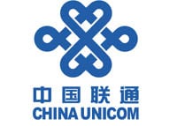
China Unicom Logo (2006 - 2008) (Primary) (2008 - 2014) (Secondary)

(2008 – 2020)

In 2008, China Unicom and China Netcom Corporation merged, thereby necessitating a change in the logo. So, the 2008 logo iteration retained the previous logo and its elements but adjusted the typography. It adopted the China Netcom Chinese character style.

China Unicom Logo (2008 - 2020)

(2020 – 2023)

The 2020 logo iteration brightened the corporate red while keeping the rest of the elements intact. In fact, as per community trackers and CSR materials from that year, the logo change mentioned only the colour rather than a structure.

China Unicom Logo (2020 - 2023)

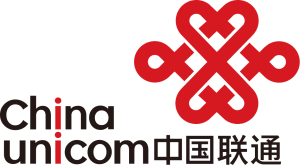
(2023 – Present) (Primary) (2022 – 2023) (Secondary)

The current logo shows the endless knots emblem to the left in vibrant red and the logotype to the right in black. So, the change was not substantial but only about the positioning of the emblem with respect to the text.

China Unicom Logo (2023 - Present) (Primary) (2022 - 2023) (Secondary)

The Elements of the China Unicom Logo

Font

The “China Unicom” text is set in a custom sans-serif typeface, which is clean, geometric, and modern. Among the characteristics of the font are two lowercase “i”s. These are designed to look visually aligned to reinforce the brand’s theme of connection.

Colour

The colour palette of the China Unicom logo comprises red and black. The vivid red colour is used for the “endless knot” emblem. In Chinese culture, red represents prosperity, vitality, luck, and strength. So, for China Unicom, it conveys energy, passion, and connectivity.

The English wordmark and the Chinese characters in the logo are rendered in black. The colour gives the logo a professional, authoritative, and modern feel. It balances the liveliness of red with seriousness and clarity.

The History of China Unicom

China Unicom was established in 1994 as one of China’s first licensed telecommunications operators. It was created to introduce competition into a market that was previously dominated by China Telecom. In its early years, the company focused on developing mobile services, international calling, and data communication. Thereafter, it gradually expanded its customer base across the country.

A major milestone came in 2002, when China Unicom became the world’s first operator to run both GSM and CDMA networks simultaneously. In 2008, a government-led industry restructuring merged China Unicom with China Netcom. In doing so, it strengthened its fixed-line and broadband services while transferring its CDMA business to China Telecom.

The following year, Unicom launched its 3G WCDMA network and positioned itself as a pioneer in high-speed mobile internet. In 2009, it also became the first official carrier of Apple’s iPhone in China. Over the years, the company has continued to innovate. For instance, it introduced the “WO” sub-brand for mobile internet, expanded into 4G and 5G networks, and ventured into cloud computing, big data, and IoT solutions.

China Unicom serves hundreds of millions of customers and operates internationally through subsidiaries in over 30 countries. It remains a key player in China’s digital transformation and global connectivity efforts.

Interesting Facts About China Unicom

  • After China Mobile, China Unicom serves hundreds of millions of subscribers across mobile, broadband, and enterprise networks.
  • Besides its massive domestic market, China Unicom operates subsidiaries in over 30 countries and regions. It also provides services to international businesses.
  • China Unicom is a state-owned enterprise, directly under the administration of the State-owned Assets Supervision and Administration Commission (SASAC).
  • The logo is based on the Pan-chang (Endless) Knot, which is a traditional Chinese auspicious symbol representing continuity, connectivity, and harmony.
  • The curves of the knot resemble interlocking hearts to symbolise communication from the heart and human connection.
  • The switch to a red knot with black lettering distinguished the China Unicom logo from other telecoms that typically used blue logos.
  • In 2009, China Unicom launched its WCDMA-based 3G network, which had beaten competitors in speed and coverage at the time.
  • China Unicom introduced the “WO” brand for its mobile internet services, with the name symbolising “我 (wǒ / me)” and “World Online”.
  • It is one of the leaders in China’s 5G rollout. It is into building shared networks with China Telecom to accelerate coverage.
  • Beyond telecom, Unicom has invested in big data, IoT, and AI-powered cloud computing for smart cities and enterprises.
  • China Unicom was the first carrier to officially bring the iPhone to China in 2009.
  • It partners with global tech giants like Microsoft, Alibaba, and Tencent to develop cloud and edge computing solutions.
  • Unicom participates in several international submarine cable projects to strengthen China’s digital connectivity with the world.
  • China Unicom consistently ranks on the Fortune Global 500 list, which showcases its scale and global importance.
  • While state-owned, China Unicom (Hong Kong) Limited is also publicly traded on the Hong Kong Stock Exchange.
  • In mainland China, the brand mainly uses the red endless knot, while its Hong Kong arm has experimented with different logo variations.

Finally

The evolution of the China Unicom logo reflects a balance between cultural heritage and modern innovation. Since its introduction in 1994, the endless knot has remained a powerful emblem of connectivity, continuity, and harmony. It has become one of the most enduring and recognisable logos in China’s telecom industry.

The consistency shown by China Unicom in its logo design has allowed it to build a strong brand identity rooted in tradition while staying relevant in an ever-changing digital era. The logo, besides representing a telecom provider, also embodies the company’s role in linking people, technology, and the future.

Leave a Reply

Your email address will not be published. Required fields are marked *