DuckDuckGo is widely recognised as a privacy-centric search engine and browser. It is committed to protecting user data and promoting online anonymity. At the core of its brand identity is a distinctive and friendly mascot logo. It is an emblem that has evolved alongside the company’s growing mission and expanding product line. This article traces the history and evolution of the DuckDuckGo logo, which visually symbolises the company’s values of privacy, accessibility, and trust.
The Genesis of the DuckDuckGo Logo (2008 – 2010)
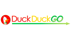
The original logo featured the head of a goose looking right on a red background. The bird’s beak was shown to be partially open, and the image was taken at an angle to make the bird appear to be smiling. The other aspects of the emblem were the green bow tie on the neck of the goose and the plumage on the head. To the right of the emblem appeared the inscription “DuckDuckGo” in a colour scheme comprising red, yellow, and green, respectively.
The words were rendered in a classic sans-serif typeface, while the letters “GO” appeared in italics. Interestingly, the word “GO” appeared in uppercase, while “DuckDuck” appeared in the title case. Beneath the inscription was placed a right-pointed arrow where the left side was darker than the right.
(2010 – 2012)
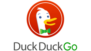
In the subsequent logo iteration, the goose emblem was placed on top of the inscription. The circular emblem got a white outline to look modern. The wordmark “DuckDuckGo” was rendered in a single style in a rounded sans-serif typeface. The words “DuckDuck” appeared in black, while “Go” was given a green makeover.

(2012 – 2014)
The 2012 logo iteration had minimal changes, which went almost unnoticed. For instance, the colour of the word “DuckDuck” was turned into dark grey from black, while “Go” appeared in a brighter shade of green.
(2014 – 2023)
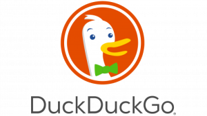
In the 2014 logo variant, the colour scheme of the circular goose emblem was turned closer to orange from the bright red earlier. The white outline in the circular emblem was made thicker, and the inscription was rendered entirely in grey.
(2023 – Present)
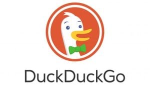
The latest DuckDuckGo logo variant has retained its elements but with subtle changes. For instance, the circular goose emblem is made more rounded and friendly; the bird’s head and beak look a little smoother. The background colour of the circular emblem appears less aggressive and more pleasant to the eye. The design underscores the core philosophy of the search engine, that is, to be accessible and user-friendly.
The Elements of the DuckDuckGo Logo
Font
The wordmark used in the DuckDuckGo logo is created using a classic sans-serif typeface.
Colour
The colour palette used to design the DuckDuckGo logo includes several shades of white, grey, yellow, green, and orange.
Finally
The evolution of the DuckDuckGo logo reflects how the company stood steadfast in its dedication to user privacy, accessibility, and trustworthiness in the digital space. Unlike many privacy brands that use abstract or lock imagery, DuckDuckGo’s choice of a playful duck mascot sets it apart. In fact, the logo is a case study in how a mascot combined with consistent design and strategic evolution creates a powerful, approachable, and trusting brand identity for privacy technology.