Arcelik is a Turkey-based brand of home appliances and consumer electronics and is the owner of the Beko and Grundig brands. Founded in 1955 as a small workshop for manufacturing electric motors and transformers, the company has come a long way. Today, it operates in more than 130 countries and is the recipient of several awards and accolades for its commitment to eco-friendly products and practices.
It is a subsidiary of Koc Holding, which is arguably the largest industrial group in Turkey. Its logo has undergone several transformations to reflect the journey of the company from a local manufacturer to a global leader. The article delves into the various logo changes of Arcelik, among other details of the company.
The Genesis of the Arcelik Logo (1955 – 1960) (Primary) (1960 – 1968)
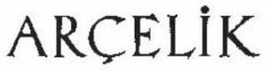
The original logo design was straightforward and was limited by mid-century typographical and design standards. It featured the brand name in black and was written using a simple, thin serif typeface with basic geometric elements. Although the brand name was written in uppercase, the letter “I” had a dot above it. There was a tiny smudge below the letter “C”.
(1955 – 1960) (Secondary)
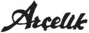
Another logo was designed during this period, which was tagged as secondary. It featured the brand name in a cursive title case and in thick black letters.
(1950s) (Unused)
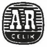
A few logos were designed during the fifties, but they were never made official. The first one featured a circle in monochrome containing the wordmark “ARCELIK” in two levels. The letters “AR” in white and in thick serifs with a black outline and shadows were placed against a bigger background that consisted of a series of alternate black and white stripes. The remaining letters of the brand name “CELIK” in white were placed below in a smaller size against a black background.
(1950s) (Unused)
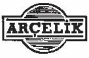
Another unused logo during this period featured the brand name in black uppercase placed within a horizontal rectangle with a black outline and white background. The rectangle was further connected to a circle at the centre, having a series of black and grey stripes.
(1990s) (Unused)
The unused logo during this period featured the brand name written in a rounded sans-serif typeface in black. However, the letter “a” was depicted in red but in a spiral form.

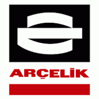
(1968 – 2002)
Around 1968, Arçelik adopted a more stylised logo that featured a monochrome emblem and the wordmark in red uppercase. The emblem contained geometric elements in white that looked like two wide arcs at the top and bottom and a thick horizontal stripe in the middle – all pitted against a black square background. The red wordmark in a sans-serif typeface was placed below the emblem and above a thick horizontal stripe, also in red.
(2002 – Present)
The most recognisable version of the Arçelik logo appeared in 2002. It introduced the “Flex” concept, which has been derived from the dynamic transformation of the bent steel motif. This linked heritage as well as the layered meanings of flexibility and technological innovation for a global era.
The bent steel motif in red was followed by the brand name in black lowercase and written using a gently rounded and italicised sans-serif typeface. Interestingly, in the wordmark, the letters “a” and “e” looked like mirror images of each other.

(20?? – Present)
The present logo features the brand name in red title case against a red background. There is a tiny dash below the letter “c”, also in red.

The Elements of the Arcelik Logo
Font
The Arçelik logo features a custom lowercase sans-serif font to reflect modernity and approachability. The key characteristics of this font include gentle, rounded edges on each letter in lowercase to project friendliness and a modern outlook.
Colour
The signature colour of the Arçelik logo is vibrant red to convey energy and technological innovation. Besides, it symbolises Turkish national pride, as the colour forms a prominent part in the country’s flag and design aesthetics. The other colours donning the logo are black and white, which support minimalism and align with the global branding trends towards simplicity.
Finally
The Arçelik logo and its various iterations have evolved over the years to become an emblem of Turkish ingenuity. These combine local symbolism with international design trends. The logo journey continues unabated as the company leads the way in technological innovation and sustainability.