The roots of Jabra can be traced back to the early 1980s with the founding of Jabra Corporation (Norcom Electronics of America). This was later acquired by GN Audio, a division of Denmark’s GN Group. Over the decades, Jabra has become synonymous with innovation in audio and communications technology. It pioneered many things, such as Bluetooth headsets and advanced noise-cancelling headphones. The Jabra logo has remained a consistent visual representation of the brand. The article delves into the evolution of the Jabra logo, among other details of the company.
The Genesis of the Jabra Logo (???? – Present)
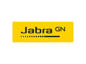
The Jabra logo is a clear and consistent visual representation of its brand and conveys confidence, innovation, clarity, and accessibility. The most iconic version of the logo is a simple wordmark, that is, the brand name “Jabra” and “GN” as a superscript rendered in a black sans-serif typeface against a bright yellow rectangular background.
This colour palette of yellow and black has become a hallmark of the company’s visibility in the competitive audio equipment industry. The logo also featured a thick horizontal line as an underscore, which starts with a series of square dots increasing in size.
The Elements of the Jabra Logo
Font
The Jabra logo uses a modern, clean sans-serif typeface as its font, which reflects clarity and accessibility. The primary typeface family used in company communications is the Myriad family, which is a highly legible sans-serif font. This font has been chosen for its clean and modern appearance that aligns with Jabra’s innovative and quality-driven brand identity.
Colour
The colour palette of the Jabra logo combines bright yellow and black. The combination of black typography on a yellow background creates a visually striking and easily recognisable logo. It emphasises energy, optimism, and innovation. The characteristic yellow background conveys energy, optimism, and innovation, which stands out in a mostly monochrome tech landscape.
Finally
The Jabra logo represents a long-standing commitment to quality, innovation, and clarity in audio communications. Its minimalist style, consistent colour palette, and unified branding strategy have helped build one of the most recognisable visual identities in the global audio industry. Although the timeline of its logo is not available, it has remained a prominent visual identity of Jabra in the highly competitive technological landscape.