Chainlink Labs is a leading Web 3.0 development company, which is best known for creating and maintaining Chainlink, the world’s most widely adopted decentralised oracle network. It was founded in 2014 by Sergey Nazarov and Steve Ellis, with cryptography pioneer Ari Juels as Chief Scientist. The company helps bridge the gap between blockchain smart contracts and real-world data, APIs, and traditional financial systems.
Since its inception, Chainlink has become a cornerstone of the blockchain ecosystem, and its branding, especially its logo, has evolved to reflect its growing influence and technological advancements. The article deals with the evolution of the Chainlink Labs logo, among other details of the company.
The Genesis of the Chainlink Labs Logo (2017 – 2021) (Unavailable)
The original Chainlink Labs logo is not documented for public access. However, it is likely to have reflected the Chainlink logo, that is, to have been inspired by the hexagon emblem.
(2021 – Present)
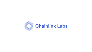
In the latest logo iteration designed by the creative director Julian Alterini, the chain-link symbol remained central but with sharper edges and a more polished metallic effect. The colour palette remained blue, but with gradients to enhance visual appeal. The wordmark “Chainlink Labs” is placed beside the emblem and written in a modern, bold, and stylised serif typeface.
There are two versions of the logo, one with a deep blue background and a white wordmark in the foreground along with the hexagonal-inspired emblem. The other logo had a blue wordmark, which along with the emblem, featured against a white background.


The Elements of the Chainlink Labs Logo
Symbol
Chainlink Labs uses the blue hexagon mark alongside the wordmark, typically on a white or very light background. The logo design reinforces clarity and a sense of secure digital connectivity.
Font
The Chainlink Labs logo employs a geometric sans-serif font to convey a modern and elegant aesthetic.
Colour
The primary official colour of the Chainlink logo is a distinctive blue to symbolisetrust and technological reliability. There is an additional colour palette comprising off-whites, darker navy, and accent colours.
Finally
The Chainlink Labs logo has evolved from a simple chain-link icon into a sophisticated, professional emblem. The logo evolution reflects the project’s growth from a niche oracle solution to a fundamental piece of blockchain infrastructure. Each iteration has reinforced the core values of Chainlink: security, connectivity, and innovation.