Peking University, or PKU, was founded in 1898 during the late Qing Dynasty as the Imperial Academy. It is the oldest and one of the most prestigious higher education institutions in China. The university is known for its rigorous research environment and hosts over 200 research institutes and national key laboratories. It has played a significant role in China’s intellectual and cultural development.
The university did not originally have a formal school emblem or logo. It was only in 1917 that a unique visual identity was designed for the institution. The logo evolution of Peking University shows how the social, economic, and political dynamics in China have shifted. The article explores the evolution of the Peking University logo, among other details.
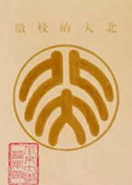
The Genesis of the Peking University Logo (1917 – 1937)
The original Peking University (PKU) logo was designed in 1917 by the renowned writer and intellectual Lu Xun. This design featured two ancient Chinese seal characters stacked vertically. The characters were crafted in traditional seal script. The upper character, “北” (“Bei”), was stylised to resemble two human figures standing back-to-back.
The lower character, “大” (“Da”), on the other hand, was represented as a single figure. This arrangement visually represented the concept of “three people make a crowd” and symbolised PKU as a place of talent cultivation and social responsibility.
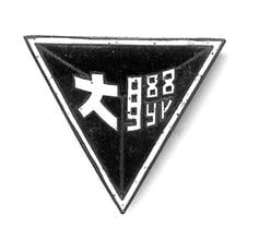
(1937 – 1946)
During the Second Sino-Japanese War, Peking University, along with Tsinghua University and Nankai University, had to relocate first to Changsha and then to Kunming to form the Southwest Associated University (SWAU). During this time, the universities adopted a temporary joint emblem. It was a logo of three triangles that symbolised unity and cooperation among the three institutions.
(1980s – 2007)
The Peking University logo ceased to be used after the founding of the People’s Republic of China. However, Lu Xun’s emblem made its return in the early 1980s, as PKU began to revisit its traditions. Some minor modifications were introduced to the old logo. These included adding the university’s English name and its founding year. Although several colour variants appeared, it was red that gradually became the dominant official colour.
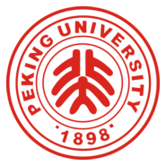
(2007 – Present)
The current logo was officially standardised in June 2007. It adheres closely to Lu Xun’s 1917 original logo but incorporates modern design conventions for clarity, reproducibility, and international recognition. The logo retained the “北大” seal script to emphasise tradition and historical continuity. It used a circular form for harmony and unity. PKU red was used as a standard colour for the logo.
Centenary Logo (1998)
In 1998, a special logo was brought out to mark the centenary year of the university. Written in Chinese script, the logo employed red colour with brown shadows.

The Elements of the Peking University Logo
Font
The font used in designing the Peking University logo is based on ancient Chinese seal script. The characters used in the logo are crafted in a traditional seal-cutting style to symbolise historical continuity while also conveying modern aesthetics.
Colour
The official colour used in designing the Peking University logo is a specific red known as “Beida Red” or “PKU Red”. This red was standardised along with the university’s Visual Identity System in 2007. The red colour reflects tradition and vitality, and it is used to ensure a strong, unified visual identity for the university.
Finally
The evolution of the Peking University logo reflects the history of the university as well as the social, political, and intellectual shifts in modern China. It remains one of the most recognisable academic symbols in East Asia and is known for its deep symbolism, cultural resonance, and enduring legacy.