Aprilia is one of Italy’s most iconic motorcycle manufacturers that is renowned both for its high-performance machines and its strong brand identity. Established in 1945 by Cavalier Alberto Beggio and presently owned by Piaggio & Co. SpA., the company began by producing bicycles.
Central to this identity is its logo, which reflects the values of the company, namely, innovation, passion, and Italian craftsmanship. Over the decades, the Aprilia logo has evolved in step with its journey from a small bicycle manufacturer to a global leader in motorcycle racing and production. The article delves into the evolution of the Aprilia logo, among other details of the company.
The Genesis of the Aprilia Logo (1945 – 197?)
The original Aprilia logo comprised a charging lion emblem facing right and the brand name in the foreground. Designed in italics and in a stylish cursive typeface, the letters of the brand name had thin grey outlines with thick grey markings inside. Further, the end of the letter “a” was extended to the left.

(1970 – 1974)
The 1970 logo iteration featured the brand name with serifs in red. Rendered in italics and in a sans-serif typeface, the logotype was in a title case with the ends of the letters “i”, “l”, and “a” slightly protruding to the right.

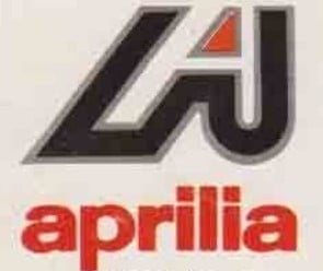
(1975 – 1985)
In the 1975 logo iteration that lasted up to 1985, there was an italicised letter “A” in uppercase with thick grey outlines and a white interior. The letter was placed within a bigger black background with similar contours but with grey outlines. The small triangle formed by the letter was marked in red. Beneath the enlarged “A” was placed the brand name in red lowercase and rendered using a sans-serif typeface.
(1986 – Present)
The current logo features a bright red rectangular background with white “aprilia” text written in a traditional sans-serif typeface.The red colour conveys the progressive approach of the company, while the white lettering is about brand loyalty and reliability. The simple and minimalist logo is both eye-catching and memorable and evokes warm feelings.

The Elements of the Aprilia Logo
Font
The Aprilia logo consists of a single wordmark rendered in a traditional sans-serif typeface in lowercase. It is similar to Swiss 721 BdOul BT with clean lines. Besides, the letters “A” and “P” have bold curves and adequate spacing between the dots and the main body of the letter “I”.
Colour
The Aprilia logo uses a white (lettering) and red (background) colour palette.
Finally
The Aprilia logo is a powerful symbol of a brand that has risen from humble beginnings to a dominant force in global motorcycling. The Aprilia logo represents Italian craftsmanship and racing success. Its evolution shows the company’s shift from local moped maker to internationally respected innovator and racing powerhouse.