Singtel, or officially Singapore Telecommunications Limited, is one of Asia’s leading communications technology conglomerates and a major player in the global telecommunications landscape. Based in Singapore and established in 1879 as the Oriental Telephone and Electric Company, Singtel has a rich legacy. It offers a diverse range of services, such as mobile and fixed-line telephony, broadband, digital television, and enterprise ICT solutions.
It has operations and investments that are spread over twenty countries, such as Australia, India, Indonesia, and the Philippines. The Singtel logo has evolved over a period of time and chronicles the journey of the company. The article delves into the various logo changes undertaken by the company, among other details.
The Genesis of the Singtel Logo (1882 – 1955)
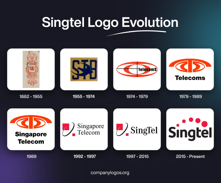
The forerunner of Singtel was the Oriental Telephone & Electric Company, or OTEC, and its original logo reflected the same. It featured a vertical scroll-like banner with ornate embellishments. At the centre of the logo was placed a red and pink rotary dial telephone on a shield and a crown atop, surrounded by a floral wreath. The whole logo was decorated in an abundance of red and pink shades.

(1955 – 1974)
In 1955, the OTEC network was taken over by the government and renamed the Singapore Telephone Board, or STB. The logo featured the abbreviation “STB” in a sans-serif typeface in uppercase against a coffee-coloured background. A trident-shaped graphic looking like a bird in flight formed the foreground in black.

(1974 – 1979)
The 1974 logo design featured two ellipsoids with both orange (outer) and red (inner) outlines. At the centre of the ellipsoids was the intersection of two thin black lines, horizontally and vertically. The word “telecoms” was written as an extension to the horizontal line, and the letter “s” was slightly bigger than the rest of the letters.

(1979 – 1989)
The 1979 logo was designed to mark the centenary of the telephone service in Singapore. It featured an emblem comprising an ellipsoid divided into two halves facing each other. The letter “T” stood in the middle of the two ellipsoids with the horizontal bar arched downwards to look like a telephone receiver. Beneath the emblem was mentioned “Telecoms” in black lowercase.

(1989)
The 1989 logo was designed when the company was renamed Singapore Telecom. It featured the previous logo design with the word “Telecoms” replaced by “Singapore” “Telecom” in two levels in bold black.

(1992 – 1997)
In 1992, the Telecommunication Authority of Singapore was divided into three companies. These were the reconstituted Telecommunication Authority of Singapore, Singapore Telecommunications Private Limited, and Singapore Post Private Limited. The 1992 logo featured an emblem comprising a tilted ellipse in black and two red squares of unequal dimensions.
These elements were meant to be symbols of global connectivity and technological innovation. The colour red signified energy and strength, while the modern typeface expressed accessibility. The brand name “Singapore Telecom” was mentioned two levels to the right of the emblem in a custom serif typeface.

(1997 – 2015)
The previous logo was redesigned with a few changes. Although the emblem comprising a tilted ellipse and two squares of unequal dimensions remained, the wordmark “Singapore Telecom” in two levels was replaced with a single wordmark, “SingTel.” The serif-rich wordmark in black had two letters, “S” and “T,” capitalised.

(2015 – Present)
On 21 January 2015, Singtel unveiled its first major rebrand in 16 years. It marked a significant transition for a company from a traditional telecom provider into a multimedia and ICT (Information and Communications Technology) services powerhouse. The most distinctive change is a dotted red arc crowning the logotype “Singtel.” This arc represents Singtel’s ongoing transformation and continuous innovation.
The stylised “t” in “Singtel” is now lowercase, which symbolises an embrace of heritage and a friendlier, more approachable identity. Here, Singtel retained its recognisable red and black colour palette. It stands for energy, passion, and strength, and it enables creating a visual link to earlier designs while signalling a step forward.

The Elements of the Singtel Logo
Font
The current Singtel logo uses a custom modern sans-serif typeface. Fonts similar to the one used in designing the Singtel logo include DIN and Ubuntu Bold. However, Singtel has often relied on versions of Helvetica Neue Light for web presence and marketing. The font used in the Singtel logo displays bold styling with rounded edges and a friendly, modern feel.
Colour
The Singtel logo features a colour combination of red and black, where red is characterised by an arc of dots to symbolise energy, innovation, and dynamism. Black, on the other hand, constitutes the wordmark and conveys reliability, strength, and professionalism.
Finally
The journey of the Singtel logo is a story of Singapore’s growth. The logo iterations show how the company rose from a colonial telegraph office to become a global leader in communications and digital technology. Each logo change marks a new chapter of embracing change, innovation, and commitment to connecting people across Asia and beyond.