Harley-Davidson is the quintessential American motorcycle brand that represents quality, the spirit of adventure, and innovation. Founded in 1903 in Milwaukee, the motorcycles are a blend of modern technology and timeless design. The motorcycles offer an unparalleled experience of power, pride, and performance. The Harley-Davidson logo is one of the world’s most recognisable brand emblems.
Like the product itself, the logo symbolises freedom, power, and classic American craftsmanship for over a century. Its evolution showcases the journey of Harley-Davidson from a Milwaukee shed in 1903 to the global icon it is today. The article explores the various logo changes undertaken by the company, among other details of the company.
The Genesis of the Harley-Davidson Logo (1903 – 1910) (Unavailable)
Although the company was founded in the year 1903 in a shed, it did not have any logo or visual identity till 1910. In fact, “Harley-Davidson Motor Company” was just painted or stamped onto the motorcycle in plain typography.
(1910 – 1953)
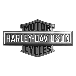
In 1910, the original logo of Harley-Davidson came into existence with the now-iconic “Bar and Shield” emblem. This simple yet bold design consisted of a horizontal bar, inscribed with “Harley-Davidson,” in white uppercase and in a bold traditional typeface.
It was laid over a shield with the words “Motor” and “Cycles” in black uppercase displayed in both upper and lower parts. The colour palette utilised black, grey, and white with a gradient to convey strength and dependability. The horizontally oriented bar represented stability, while the shield signified protection.
(1929)
To face the challenges posed by the Great Depression, Harley-Davidson redesigned its logo by introducing an eagle to the bar and shield design. This was done as the eagle is the national symbol of the USA and symbolises liberty, courage, and independence.
(Early 1930s)
Although the skull logo was an unofficial one, it became quite popular, especially with a group of riders called “Outlaws.” It featured a white skull with black accents against a circular black background. The brand name in white uppercase was written around the edge of the circle.

(1953 – 1965) (50th Anniversary Logo)
In 1953, Harley-Davidson introduced a significant logo change to mark its 50th anniversary. The emblem in metallic chrome colour incorporated a large, stylised “V” behind the Bar and Shield to honour its famed V-twin engine. The anniversary medallion included “50 YEARS” and “AMERICAN MADE” inscriptions in custom cursive typography, while the logo itself took on a more robust, metallic look.

(1965 – 2003)
In 1965, the logo comprising the bar and shield was turned monochrome. The bar and shield emblem were refined and made to look masculine and powerful.

(2003) (100th Anniversary Logo)
The centenary celebration of the company resulted in a logo that had the bar and shield emblem enclosed within a circular frame with two wings. To the left of the wing was written “1903,” while the right mentioned “2003.” The numerals “100” were written in an arched way and placed under the shield emblem.

(2008) (105th Anniversary Logo)
The 2008 anniversary logo was designed to mark 105 years of the company. The “105 years” inscription is written above the emblem to form a crown. The dates 1903 – 2008 were placed at the bottom of the emblem with a star separating the numbers.

(2013) (110th Anniversary Logo)
The 2013 logo iteration was made to celebrate the 110th anniversary. It featured the usual double-winged logo in mustard colour, but with the inscription “110” at the top against a black background. On top of the emblem was written the name of the company in a black sans-serif typeface with shadows. At the bottom of the emblem was written “110 YEARS OF GREAT MOTORCYCLES.”

(2018) (115th Anniversary Logo)
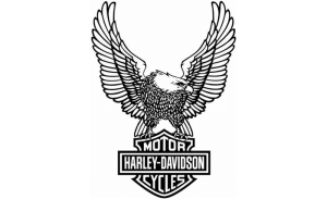
The 115th anniversary logo was designed in 2018 and saw the return of the bald eagle holding the bar and shield emblem in its claws. A large “115” inscription was placed in front of the bar and shield emblem with “1903” and “2018” placed on the left and right. Also, the word “YEARS” is placed at the bottom of the logo.

(2023) (120th Anniversary Logo)
In 2023, the 120th anniversary logo was unveiled. It featured the brand name in red and yellow colours in two levels and set against a black rhombus with a thick mustard yellow outline.

(1980s – Present)
The current logo is a remake of the original logo of 1910 but with refinement. It features the bar and shield logo surrounded by a thin black outline. Here, the brand name in white is placed at the centre against a black background and delineated by orange colour. The words “MOTOR” and “CYCLES” were mentioned in the upper and bottom parts of the shield in orange lettering and outline.

The Elements of the Harley-Davidson Logo
Font
Most Harley-Davidson logos have featured sans-serif typefaces that have had stylish and blocky appearances.
Colour
The current Harley-Davidson logo displays a black and orange theme. Here, black exudes a sense of class, simplicity, elegance, and sleekness. Alternatively, black can also bring about an edginess that can go well with riding. Orange, on the other hand, exudes energy, creativity, personality, and enthusiasm. There is a subtle touch of white as well to promote purity and balance.
Finally
The Harley-Davidson logo has become one of the most enduring symbols in American pop culture. Its Bar and Shield design represents over a century of craftsmanship, rebellion, and freedom. The company has shown that consistency, with occasional tasteful evolution, can build a legendary brand identity. Thus, from the back roads of America to the highways of Europe and beyond, the Bar and Shield continues to inspire loyalty, passion, and pride among riders worldwide.