The Royal Bank of Canada, or RBC, is one of the largest and most influential banks in Canada and globally. Established in 1864 in Nova Scotia, by sea merchant entrepreneurs, as the Merchants Bank of Halifax, the Royal Bank of Canada operates worldwide and has a customer base of more than 15 million across the globe.
The logo of RBC is famed for its regal lion and globe, and has been a key branding element that reflects the bank’s values, growth, and global aspirations. The article explores the history of various logo iterations of the bank over the years, among other details.
The Genesis of the Royal Bank of Canada Logo (1864 – 1869) (Unavailable)
The Royal Bank of Canada (RBC) traces its roots back to the Merchants’ Bank of Halifax, founded in 1864. The early banking symbol(s) is not available. In fact, the first known logo for the bank is from the year 1869 and which lasted till 1901.
(1869 – 1901)
The first logo or corporate seal of the Merchants Bank of Halifax featured two concentric circles where the inner circle showed a modern three-mast sailing ship with an auxiliary engine. The circular edge had the inscription “MERCHANT’ BANK OF HALIFAX” and “INCORPORATED 1869” in uppercase monochrome. The outer circle constituted a series of black dots rather than a curved line.

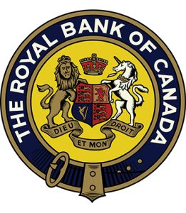
(1901 – 1962)
In 1901, after the renaming of the Merchants Bank of Halifax to “The Royal Bank of Canada,” the bank revised its seal. This new identity focused on the “Royal” name and incorporated elements that were inspired by Britain’s Royal Coat of Arms. The use of a royal insignia was intended to impart values of strength, tradition, and stability. The main elements of the logo were a lion, a Scottish unicorn, a coat of arms, a crown, and a ribbon with the words “AMARI USQUE AD MARE.”
These were placed within a yellow circle in a blue strap ring. The new name “THE ROYAL BANK OF CANADA” was written along the edge of the circle in bold white uppercase. This became Royal Bank’s first widely recognized symbol and showed its growing stature across Canada and abroad.
(1962 – 1974)
A major rebranding occurred in 1962, wherein RBC introduced its first modern logo. Designed by the legendary American studio Lippincott & Margulies, the new design embraced heraldic motifs by blending four key elements in grey and white. These include the lion to represent strength and authority, the crown to emphasise the royal aspect, the globe to symbolise RBC’s growing international presence, and the Fleur-de-lis flower to reflect the bank’s Canadian roots. The lion was turned to the left and enlarged to keep the focus on its head and the mane. It held its front paw on the globe to symbolise the growing presence of the bank.

(1974 – 2001)
In 1974, legendary designers Freddi Jaggi and Fritz Gottschalk further refined the logo. Their redesign involved simplifying the image by removing the finer details, such as the lion’s mane in favour of bolder, cleaner lines. Thus, by enhancing scalability and legibility, the logo was made to fit on both signage and printed materials. Besides, the colour grey was replaced with black. This iteration of the “Lion and Globe” established the foundation for what would become one of Canada’s most recognized corporate emblems.

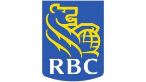
(2001 – Present)
In 2001, the heraldic shield in deep blue colour with a rectangular rounded base made a comeback. Inside the shield appeared the contours of a golden lion facing right with a globe at the top. The bottom of the shield had the inscription “RBC” in white uppercase.
The Elements of the Royal Bank of Canada Logo
Font
The abbreviated wordmark of the Royal Bank of Canada logo is rendered in a bold, custom serif typeface in uppercase. The uneven thickness of the strokes changes from wide to narrow, thereby making the logo unique. The fonts that are similar to this are Aviano Serif Black or Sava Semi Bold.
Colour
The Royal Bank of Canada logo employs a combination of blue, yellow, and white colours to add a touch of professionalism, energy, and confidence.
Finally
The evolution of the Royal Bank of Canada logo is a powerful narrative of how a visual identity can reflect institutional growth, heritage, and forward-looking vision. From its early, unofficial emblems to the globally recognized lion-and-globe insignia, RBC’s logo tells a story of prestige, progress, and purposeful design.