Ameriprise Financial offers a suite of financial services by virtue of being one of the largest corporations in America. The services offered by the company include banking, asset management, and insurance for a host of individuals, groups, and companies. Its roots can be traced back to 1894, when Investors Syndicate was founded in Minneapolis, Minnesota, USA. This pioneering financial company had the bold vision to help ordinary Americans achieve their financial goals. The company was set up at a time when financial services were primarily reserved for the wealthy. On its part, Investors Syndicate aimed to democratise access to investment opportunities and financial planning.
Investors Syndicate was formed in response to a growing American middle class and their need for financial guidance and security. This became possible as the economy of the nation expanded and industrialization became a reality. Consequently, a greater number of individuals found themselves with disposable incomes and a desire to secure their financial futures.
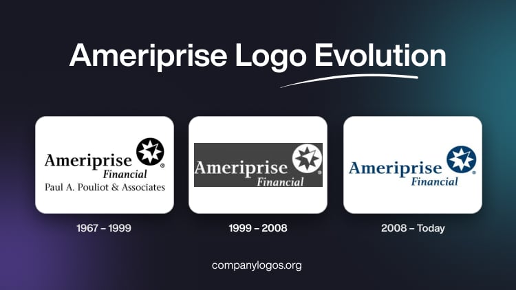
It was then that Investors Syndicate saw an opportunity to service this underserved market by offering a slew of investment products. It also offered financial advice that was tailored to the needs of ordinary Americans. The logo of Ameriprise did not change much over the course of its existence. For instance, the logo of 1967 and the current one are not much different. This article delves into the history and existence of the Ameriprise logo over the years, among other details.
The Genesis of the Ameriprise Logo (1967 – 1999)
The Ameriprise Financial logo has a simple and effective design that captures the brand essence of the company. The original logo does not exist anymore. In fact, surprisingly, the records of the company logo can be traced only from 1967 onwards. The logo featured the company name in bold title case at two levels. The word “Ameriprise” was written at the top in a large, bold font, whereas the much smaller word “Financial” was written in the next line.
Below these two words were mentioned the names of the owners, “Paul A. Pouliot & Associates.” The names conveyed a sense of stability, trust, and confidence. Alongside the wordmark was an emblem comprising a white star with eight pointers. And one of the pointers on the top right side was replaced by an arrow in black.

(1999 – 2008)
The logo iteration of this period was quite similar to its earlier avatar. It contained the wordmark at two levels, along with the star emblem. The third wordmark of “Paul A. Pouliot & Associates” was conspicuous by its absence. Interestingly, the colour palette of this logo is the exact inverse of its previous version: white letters set against a dark grey background.

(2008 – Today)
The present logo was designed in 2008 and it did not deviate much from the previous version. It also comprised two wordmarks at two levels, with a star emblem on the right. The wordmark “Ameriprise” is rendered in a sans-serif font and appears with bigger letters. On the other hand, the wordmark “Financial” is rendered in italics and in smaller letters. Also, there is a star-spangled emblem rendered in a white and royal blue colour scheme. It shows the emblem as reliable and professional, one that evokes trust and loyalty.

The Elements of the Ameriprise Logo
Font
The Ameriprise Financial logo features a classy and elegant wordmark that is rendered in a bold serif typeface. The letters have thick, smooth lines, which offer an air of sophistication and refinement. While the exact font used in the logo may not be widely available, the closest one could get is likely to be Charlotte Serif Medium or Skema Pro Display Medium.
Colour
The colour palette of the visual identity of Ameriprise Financial happens to be a deep and calming shade of blue. This rich colour represents stability, professionalism, and reliability. The blue colour conveys a sense of confidence and assurance. It reflects the commitment of Ameriprise Financial to safeguard the financial well-being of its clients.
Finally
With a rich history spread over a century and a strong reputation for trustworthiness and expertise, the company aims to shape the future of financial services.