Suzuki is a world-renowned Japanese motor company that specialises in the manufacture of a wide range of vehicles. These include motorcycles, cars, ATVs, and more. Founded in 1909 by Michio Suzuki, the company operates in about 192 countries. The Suzuki logo is a distinctive emblem that has evolved alongside the company. Its history illustrates the design trends of the day as well as the shifting corporate ambitions and cultural values. The article delves into the evolution of the Suzuki logo, among other details of the company.
The Genesis of the Suzuki Logo (1909 – 1952)
The original logo featured a mirrored image of a stylised bird creating an “S” shape to symbolise grace and the company’s initials. This classy black and white logo had the brand name written in a modern geometric sans-serif typeface in uppercase. It was placed at the centre of a graphical emblem depicting the shape of the letter “S” as two mirror images of a bird with sharp wings.

(1952 – 1957)
The 1952 logo did away with the bird emblem and featured only the logotype “Suzuki” in italicised uppercase letters and rendered using a sans-serif typeface in black.

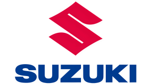
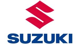
(1958 – 2025)
In 1958, as Suzuki shifted focus more heavily toward the automotive and motorcycle industries, it unveiled the logo that would become synonymous with the brand. It was a bold, angular, stylised “S” in red. It showcased thick geometric lines conveying power and clarity, with the company name “Suzuki” in uppercase set in a Helvetica-like font appearing below the emblem. The emblem and the wordmark were designed in a red and blue colour palette. In this scheme, the red “S” stood for passion and integrity, while the blue wordmark signified class and brilliance.
(2025)
In April 2025, Suzuki unveiled its first significant logo update in almost 40 years. The new iteration retains the essential shape of the stylised “S” but introduces thicker lines, a deeper red for the “S,” and a darker, bolder blue for the wordmark. It uses a more modern high-contrast font for improved legibility on digital platforms and vehicle displays.
(2025)
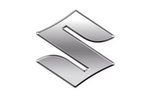
Suzuki boasts two types of logos: a red and blue corporate logo for the website and other marketing materials, and another chrome-plated 3D logo to be used as a badge on cars and motorcycles. Of late, the carmaker has come out with a new badge that carries a flat design with a matte silver finish. However, the familiar “S” shape has been retained, but with a smoother edge and simpler surface.
The switch from glossy chrome plating to a high-brightness silver resembling matte aluminium is aimed at reducing environmental impact – chrome plating involves more resource- and chemical-intensive processes. The new 2D flat design logo is expected to work better on screens and align with the current design trends in the auto industry. Upon making its global debut in October, the new badge can easily be fitted to grilles of current models. In the Indian context, the new Suzuki logo is likely to feature on the Maruti Suzuki Victoris SUV and a host of other models, such as the Ertiga, Grand Vitara, and Fronx.
The Elements of the Suzuki Logo
Symbol
The Suzuki logo features a stylish letter “S” with sharp angles. The curved and pointed lines of the letter “S” were similar to the glyphs and Samurai traditions.
Font
The wordmark that forms part of the Suzuki logo is rendered in a Neue Helvetica Pro 93 Extended Black typeface. The font was developed by Max Miedinger along with Edward Hoffmann.
Colour
The Suzuki logo comes in two colours—black and white and a combination of red, blue, and white. Here, the colours black and white symbolise professionalism, sophistication, and strength. On the other hand, red symbolises passion and life, while blue symbolises trust and reliability.
Finally
Suzuki’s logo evolution is a testament to the power of thoughtful continuity and strategic modernisation. The logo unites the deep-rooted heritage of the company with a forward-thinking vision that helps customers to easily identify the brand.