Triumph Motorcycles is a reputable UK-based company from Hinckley, Leicestershire. Being the largest motorcycle manufacturer in the UK, it blends a proud heritage with cutting-edge engineering. The Triumph logo has undergone several iterations, which showcase the chequered journey of the company, its technical expertise, innovative culture, competitiveness, and quintessential British engineering. The article delves into the various logo iterations of Triumph to understand their design concepts, among other details of the company.
The Genesis of the Triumph Logo (1902 – 1906)
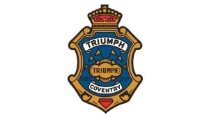
The original Triumph logo in a monochrome palette depicted a crest with a crown on its top. The crest had six flags representing all continents inside and bold, ornate text highlighting the brand name “Triumph Cycle Co. Ltd.” A tape within the shield near the bottom showed the name of the city (Coventry), where the production facilities were located.

(1907 – 1914)
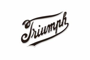
In 1907, Triumph adopted a curved Edwardian script logo in black with a grey-white outline. Placed in an oblique manner, the lower tail of the letter “h” was elongated to underscore the brand name. This script was designed to humanise the brand and move away from a cold, corporate image. It sought to depict Triumph as an approachable and trustworthy brand. The stylised hand-drawn look of the wordmark suggested the care and craftsmanship embedded in every product.
(1915 – 1922)
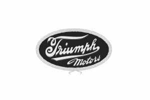
In 1915, the First World War was underway, and Triumph started manufacturing motorcycles to aid the war effort. So, to ensure a better visual identity, the logo was designed in the shape of an oval with a braided rope around the circumference. The previous wordmark in grey and white was enclosed within the black oval with the tagline “Motors” placed under it.
(1923 – 1932)
After the First World War, the Triumph logo evolved again and returned to a crest design infused with patriotic red, white, and blue to symbolise the British flag. This reinforced the brand’s national identity. This bright blue crest with a refined framing also emphasised the company’s Coventry roots, which played a major role in its status as a British motorcycle innovator.
(1932 – 1933)
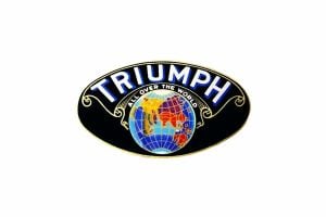
Briefly, in the early 1930s, Triumph adopted an oval globe logo. This design, often called “Triumph All Over The World,” featured the arched Triumph wordmark laid over a colourful image of the Earth to reinforce its growing international presence. Though short-lived, this logo appeared primarily on advertising and was shared with the company’s automobile division at the time.
(1934 – 1936)
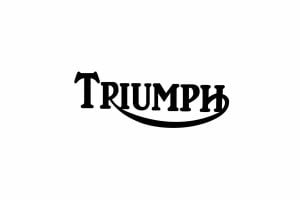
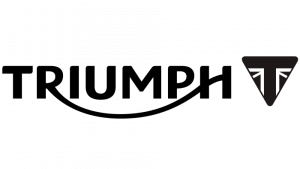
A major shift occurred in 1934 with the introduction of the famous Triumph wordmark logo, which first came in a clean, uppercase serif font. The line extending from the tail of the letter “R” to the middle of the letter “H” created a distinct “smile line.” This flowing, evocative curve is now synonymous with Triumph’s visual identity.
(1936 – 1990)
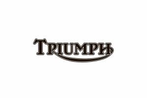
The logo update was necessitated as the company was taken over by Ariel. Here, the “Triumph” wordmark in uppercase was displayed in a slightly changed bold and heavy serif typeface. Here, the black letters appeared with a white outline.
(1990 – 2005)
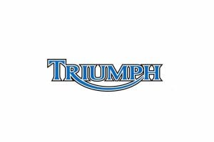
In the late 20th century, the Triumph brand was revived following economic struggles and ownership changes. The logo retained its wordmark form but was refreshed. For instance, sharper angles and a more symmetrical font modernised the logo while keeping the traditional smile line. The letters became bolder and adopted a soft blue palette with a white outline. The smile line too gained a little fluidity, wherein it emanated from the letter “R” and merged into the middle bar of the letter “H.”
(2002) (Anniversary)
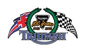
The anniversary logo of 2002 consisted of an inverted triangle in the middle, two flags to the right and left, and a green circular wreathe-like emblem with a broken top. The previous wordmark in a different shade of blue was retained to feature across the circular emblem at the bottom.
(2005 – 2013)
The 2005 logo saw a refined wordmark with bolder and cleaner lines. Introduced in a deep blue colour palette, it looked modern and stylish. In the logo, the extended tail of the letter “R” connected to the middle bar of the letter “H” resembled a smile. Also, the letter “u” was written in lowercase.

(2013)
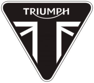
The 2013 logo saw the wordmark in uppercase return with rounded corners instead of the angular one earlier rendered in a custom sans-serif typeface. Designed by the firm Wolff Olins with typographer Rick Banks, the logo saw an inverted triangle emblem in black to the right of the wordmark. The edges of the triangle featured a pattern or fragment of the British flag.
(2013 – Present)
Another 2013 logo version that continues to this day appeared with the triangular emblem. The brand name in a custom sans-serif typeface in white is featured inside the emblem but above the flag pattern, also in white.
(2025)
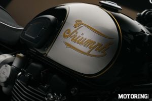
The latest Triumph logo brings back the Edwardian golden script font logo of 1907 for limited edition motorcycles.
The Elements of the Triumph Logo
Font
The Edwardian script logo of 1907, which was revived in 2005 for a limited edition of motorcycles, was rendered in a stylised black cursive lettering with a grey outline.
Colour
The revived script logo in 2025 features a monochrome colour palette with a grey outline.
Finally
The Triumph logo is more than just typography or graphic design; it is a living symbol of British engineering, freedom, and heritage. From shield to script, from crest to triangle, the brand’s identity has adapted through war, economic upheaval, and technological revolutions. And yet, it has always remained unmistakably Triumph.