SAP SE was founded in 1972 in Germany by five former IBM engineers, and it has since become one of the world’s leading enterprise software companies. The German expansion of SAP is Systeanalyse und Programmentwicklung, which means System Analysis and Program Development. As the business has evolved, so has its visual identity. The SAP logo, in particular, has undergone a fascinating transformation. It reflects both changing design trends and the company’s enduring commitment to innovation and clarity. The article delves into the various changes undergone by the SAP logo over the years, among other details of the company.
The Genesis of the SAP Logo (1972 – 1995)
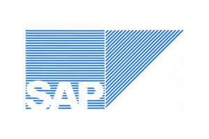
The very first SAP logo emerged soon after the company was founded. Designed in the early 1970s, this logo was reportedly crafted on the kitchen table of one of the founders’ homes in rural Germany. It showed a humble beginning emblematic of the startup ethos. The logo’s design drew inspiration from IBM and other technology companies of its era. Featuring blue and white stripes as the background, the logo conveyed a sense of sophistication and technical precision.
The letters “SAP” appeared in white, written in a bold sans-serif font, and were positioned prominently within the box at the bottom. A blue triangle accompanied the square on its right side to symbolise forward movement, growth, and future orientation. It was a subtle but meaningful touch for a tech startup. Besides, the logo’s geometric complexity was typical for enterprise tech brands of the period.
(1995 – 1999)
By the mid-1990s, SAP had achieved considerable international growth. And to enhance legibility and align with modern branding standards, SAP streamlined its logo. The striped square and triangle background became flat and solid dark blue. This made the “SAP” wordmark more legible and contemporary. This era established the foundational silhouette that is still recognisable in SAP branding today.

(1999 – 2000)
The 1999 logo update retained most of the design elements of the previous logo. However, it introduced the “smiling A” by changing the horizontal stroke in the letter “A” to an arched one. Curved slightly upward, the logo added friendliness to the otherwise stoic identity.

(2000 – 2011)
A significant revamp occurred in 2000, as the tech world entered a new millennium. The square and triangle were now seamlessly merged to reflect unified solutions and operational integration. These were values at the heart of SAP’s product philosophy. The typeface of the wordmark grew bolder, and the logo exuded a stronger sense of authority and professionalism.

(2011 – 2014)
In 2011, the SAP logo retained its geometric silhouette and “SAP” lettering. However, it did away with the solid dark blue background and brought in a modern blue gradient—dark at the base, light at the top. This choice improved digital readability and established a sleeker and more versatile emblem.
(2014)
In late October 2014, SAP briefly experimented with a bold departure. The logo was reimagined in gold, wherein it was either featured in gold letters on a transparent background or in white letters on a gold background. Also, the historic square and triangle were dropped to give the brand a minimalist and optimistic feel.

(2014 – Present)
Following feedback from employees, customers, and stakeholders, SAP swiftly reverted to the familiar blue version. This reversal highlighted the symbolic value and deep brand recognition the classic blue logo had accrued over time.

The Elements of the SAP Logo
Font
The familiar wordmark in the SAP logo is rendered using a classic, bold sans-serif typeface in uppercase. Some of the strokes have been modified to give the logo a “flavour.” For instance, the arched horizontal line in the letter “A” resembles a smile.
Colour
The SAP logo employs the colour blue, as the colour is associated with information, mental activity, and software engineering. However, white is often the colour of the wordmark.
Finally
The SAP logo’s journey has been remarkable. It shows the journey of the company from its kitchen-table origins to its present global iconic status. It illustrates both the changing landscape of software branding and the enduring need for consistency. SAP’s careful stewardship of its visual identity has helped it become a trusted name in business technology. Each logo update of SAP reflects a balance between modernity and respect for a half-century-old legacy.