The Italian fashion landscape is renowned for its elegance, innovation, and timeless allure. Among the plethora of iconic brands, A-Style stands out as a unique player with a fascinating history and a journey of evolution that has shaped its identity over the years. The origin of A-Style traces back to 1999, when a creative young graphic design student named Marco Bruns conceived a logo featuring the letter A with two points on its left side.
Although the graphic seemed innocuous, it had an underlying erotic reference. This explained the enjoyment it brought to Bruns’s friends. Inspired by its reception, Bruns transformed the design into a series of stickers and distributed them throughout Milan, and affixed them to the city’s traffic lights. The article delves into the fascinating logo of A-Style, among other details of the company.
The Genesis of the A-Style Logo (1999 – Present)
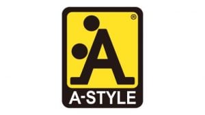
Designed by the founder, Marco Bruns, the A-Style logo did not change since its inception in 1999. It features a vertically-oriented rectangle that looks like a road sign in black and yellow. Inside the rectangle is placed a stylized letter “A” in black with its diagonal sidebars extended at the bottom and bent to the sides. Alongside the letter “A” are two solid black dots – one at the top left and another to the left of the horizontal bar. Below the yellow background was written the brand name in white uppercase against a black background.
The Elements of the A-Style Logo
Font
The understated and minimalist white lettering in the primary A-Style badge employs a clean and simple sans-serif typeface. It provides a harmonious counterpoint to the bold central element of the logo. The typeface used in this emblem is similar to fonts such a s Arial Arabic Bold or Akhbar Bold.
Colour
Turning to the color scheme defining A-Style’s visual identity, it revolves around a blend of yellow and black, complemented by the inclusion of white. Yellow, symbolizing energy and dynamism, is paired with black, representing power and confidence, while white contributes a sense of professionalism and trustworthiness to the overall palette.
Finally
The history and evolution of the A-Style logo are a captivating story of creativity, resilience, and adaptability. From the provocative stickers on Milan’s traffic lights to a globally recognized fashion brand, the A-Style logo has left an indelible mark on the Italian fashion scene.