Piaggio is an Italian company known for producing motorcycles, scooters, and compact commercial vehicles. Established in 1884 by Ronaldo Piaggio, its iconic Vespa scooters are famed for efficiency, stylish design, reliability, and mobility. Its visual identity reflects the journey of the brand over the years. The article explores the evolution of the Piaggio logo since its inception, among other details about the company.
The Genesis of the Piaggio Logo (1884 – 1946) (Unavailable)
The original logo of Piaggio is not available in the public domain, and the history of the logo can only be explored from 1946 onwards.
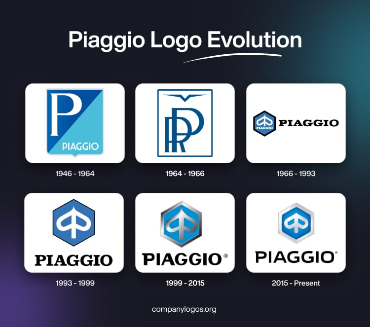
(1946 – 1964)
The earliest available Piaggio logo was introduced in 1946 alongside the iconic Vespa. It featured a shield divided transversely into two fields. The upper portion displayed a bold “P” in a white sans-serif typeface in uppercase set against a blue background.
On the other hand, the lower portion displayed the Piaggio logotype in white uppercase against a lighter shade of blue. This design symbolised stability and forward movement, and it corresponded with Italy’s post-war optimism and Piaggio’s mission to provide affordable mobility.

(1964 – 1966)
In 1964, Piaggio adopted a monogram “PR” (Rinaldo Piaggio), coupled with a stylised bird to reflect its aeronautic roots. The logo featured a dark blue framing with a white background. The monogram was written in a dark blue colour right below an abstract triangular symbol that looked like a bird. However, this logo iteration was short-lived as the brand moved towards a design more fitting for motor vehicles.

(1966 – 1993)
The 1966 logo iteration saw the introduction of an emblem, alongside the lettering. The emblem comprised a stylised wasp that appeared similar to an inverted heart and a bold vertical line. Drawn in white against a calm blue background, the emblem had the hexagonal shape of a honeycomb with a thick black outline. The brand name to the right of the emblem in bold, black uppercase was rendered in a smooth serif typeface.

(1993 – 1999)
The size of the emblem was increased in the 1993 iteration and was placed right above a modified brand name in a black serif typeface. The honeycomb-shaped emblem with the white stylised wasp got a thinner outline in black compared to its earlier avatar.

(1999 – 2015)
In 1999, the ownership of the company changed, necessitating a new logo. Owned by the Morgan Grenfell Fund, the logo aimed to have a modern identity. So, the 1999 logo iteration saw the emblem turned three-dimensional with a thick silver outline.
The inverted heart inside the emblem was depicted in glossy gradient shades. The brand name underneath was rendered in black in large capital letters using a solid sans-serif typeface with geometrically clean contours. The only exception was the serif at the top corner of the letter “P.”

(2015 – Present)
The silver gradients became lighter for a clean, luminous look and provided greater focus on the bold blue hexagon. The wordmark executed in a custom sans-serif typeface remains beneath to emphasise modernity and sophistication. The pointed serif on top of the letter “P” resembles the wasp sting, and the letter “O” in square shape has rounded corners.

The Elements of the Piaggio Logo
Symbol
The Piaggio logo emblem features a hexagon to represent a honeycomb. The brand’s symbol, a stylised wasp, is formed from the two-letter “P” by placing them face to face. This emblem symbolises the heritage of the company in a stylish way.
Font
The Piaggio logo wordmark is executed using a custom sans-serif typeface. The letter “P” displays a pointed angle to resemble the wasp sting. Also, the square shape of the letter “O” has rounded corners.
Colour
The Piaggio logo colour palette comprises silver white and light blue for the emblem and black for the wordmark. The colours make the logo appear fresh and light and the brand professional and trustworthy. The black colour of the wordmark mirrors the power and authority of the company.
Finally
The logo evolution of Piaggio shows the brand’s journey from industrial shipbuilding to a global leader in innovative mobility. Each logo redesign has balanced modern appeal with deep roots in Italian history. The logo reflects values of originality, freedom, and ingenuity that define the enduring legacy of Piaggio.