The Mitsubishi UFJ Financial Group (MUFG) or MUFG Bank is Japan’s largest financial group and is one of the world’s premier banking institutions. It was formed in January 2006 after the merger of the Bank of Tokyo-Mitsubishi and the UFJ Bank. Its logo symbolises heritage, partnership, and modernity. It reflects the deep roots of the Mitsubishi brand and the relatively recent merger with UFJ Holdings that formed MUFG in 2005. The article delves into the history and evolution of the MUFG bank logo, among other details of the bank.
The Genesis of the MUFG Bank Logo (1933 – Present)
The history of the MUFG Bank logo is rather complex, as the institution was established after the merger of several banks and financial institutions. Besides, the details of all the logos of the constituent banks or companies are no longer available. So, the latest logos of such banks are explored before they merged into the united entity – the MUFG Bank.
The Sanwa Bank Logo (1933 – 2002)
This was one of the core banks of the MUFG Bank, and its logo featured an emblem in green accompanied by the bank’s name in black. The emblem had three triangular segments in green with a white core joined at the centre. The bank’s name was rendered in a simple sans-serif typeface to the right of the emblem.

The Tokai Bank (1941- 2002)
Another constituent bank of MUFG, the logo of the Tokai Bank featured a red banner-shaped emblem with the company name written on it in white uppercase. To the left of the banner appeared a circular red emblem with three curved white lines akin to waves or hills.

The Bank of Tokyo (1946 – 1996)
The Bank of Tokyo logo featured a clover-type emblem in white with rounded edges placed within a green circle. There was also a green circle at the centre of the emblem. The bank’s name in green was written to the right of the emblem in Japanese script.

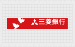
The Mitsubishi Bank (1982 – 1996)
Designed by Anspach Grossman Portugal, the Mitsubishi Bank logo featured a three-diamond-shaped emblem in red placed to the left of the bank’s name in a title case in black.

In another iteration, the Mitsubishi Bank logo featured an emblem comprising two flying white birds along with the diamond-shaped Mitsubishi symbol. The company’s name was placed to the right of the emblem. The logo elements in white were placed against a red horizontal triangular background.
The Bank of Tokyo – Mitsubishi (1996 – 2006)
Following the merger of the Bank of Tokyo and Mitsubishi, the logo featured an abstract flower-shaped emblem in red and white followed by the new bank name in black, both in Japanese and English.

Mitsubishi Tokyo Financial Group (2001 – 2005)
The Mitsubishi Tokyo Financial Group logotype featured the acronym “MTFG” in red uppercase. The first two letters of the acronym “MT” were displayed in a thick, bold style, while the last two letters, “FG,” were written in a thin font. Beneath the English logotype was mentioned the black-coloured logotype in Japanese.

The UFJ Holdings (2002 – 2005)
The logo of the UFJ, or United Financial of Japan, featured a three-dimensional golden hoop emblem alongside the bank’s name in both English and Japanese to the right in a dark brown colour.

The Mitsubishi UFJ Financial Group, or MUFG Bank (2005 – 2016)
In 2005, both UFJ Holdings and the Mitsubishi Tokyo Financial Group merged to form the combined entity Mitsubishi UFG Financial Group, or MUFG Bank. The new MUFG Bank logo comes in two variations. The first one combined the MUFG circular motif with the institution’s full name, “The Bank of Tokyo-Mitsubishi UFJ.”

(2016 – 2018)
The 2016 logo iteration saw the text “MUFG” in uppercase grey alongside the red and white circular motif. Beneath the two elements appeared the full name of the institution “The Bank of Tokyo-Mitsubishi UFJ” in grey, but in a smaller size.

(2018 – Present)
In 2018, the logo text was simply changed to “MUFG” for global consistency.

The Elements of the MUFG Bank Logo
Symbol
The logo consists of overlapping circular forms that visually represent people joining hands. It is a metaphor for unity and collaboration between the company and its customers. This element emphasises MUFG Bank’s focus on building long-term relationships and delivering comprehensive financial services. The circular design also embodies the idea of inclusivity, connection, and mutual support in fostering a brighter future.
Font
The MUFG Bank logo uses a simple sans-serif typeface that appears clean, modern, and authoritative, particularly in Western markets. The choice of a sans-serif font reflects the bank’s modern approach and global outlook. This straightforward typographic style ensures readability and reinforces the group’s commitment to accessibility and professionalism.
Colour
The logo of the Mitsubishi UFJ Financial Group (MUFG) or MUFG Bank employs three colours – red, grey, and white. The red colour, which is often referred to as “MUFG Red,” is vibrant and symbolises passion, power, vitality, and Japan’s presence on the world stage. This red is centred within the circular symbol element to serve as a focal point that conveys energy and innovation in financial services.
The MUFG grey colour complements this with a soft, silvery tone to represent sophistication, professionalism, and stability. The white background, on the other hand, signifies virtue and excellence. It reinforces trust and clarity in the brand’s identity.
Finally
The MUFG Bank logo represents the powerful legacies and collective strengths of both UFJ Holdings and Mitsubishi. Its design signifies the enduring values of unity, global vision, and connection to heritage. The logo has adapted over time to embody the aspirations of one of the world’s leading financial groups.