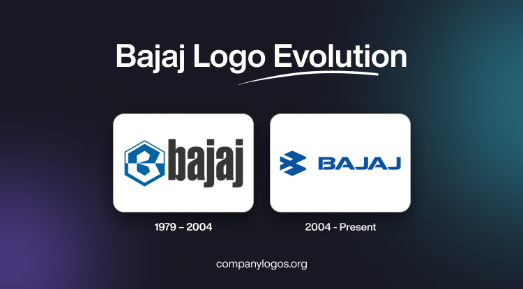
Bajaj is a multinational company from India that manufactures two-wheelers and three wheelers. Established in the 1970s, the company has diversified into fields such as home appliances, finance, and steel. The Bajaj logo shows the industrial growth of India and reflects the transformation of the company. The article delves into the evolution of the Bajaj logo over the years, among other details of the company.
The Genesis of the Bajaj Logo (1979 – 2004)
The original Bajaj logo comprised two distinct elements. These were a stylised “B” inside a hexagon, divided horizontally, and the wordmark in black. The top of the hexagon and the bottom portion of the letter “B” were rendered in white. The bottom half of the background was rendered in deep blue to signify reliability and trustworthiness. To the right of the emblem, the wordmark “bajaj” was set in a lowercase, soft, bold, and traditional font. The dark grey, or black, colour of the wordmark gave the logo a sense of stability and strength.
The hexagon “B” emblem conveyed stability and precision engineering, which reflected Bajaj’s focus on strong manufacturing. This logo became strongly associated with Bajaj’s dominant scooter lineup, especially models like the Chetak. It was further bolstered with the unforgettable “Hamara Bajaj” campaign, which embedded the brand deeply into the Indian middle-class psyche.

(2004 – Present)
The only logo change for Bajaj was introduced on January 15, 2004, at the New Delhi Auto Expo. Designed by the famed bureau Elephant Design, the emblem became an abstract, geometric form of the letter “B,” which is often described as the “Flying B.” This motif resembles a bird in flight to indicate speed, advancement, and ambition.
It references the engineering roots of Bajaj by retaining subtle hexagonal lines. To the right of the emblem is placed the brand name in blue uppercase, written using a bold, sharp, and contemporary typeface. The typeface is characterised by rounded angles, and the sides are cut diagonally. The new logo adopted a bright blue shade to symbolise technological innovation, reliability, and global vision.

The Elements of the Bajaj Logo
Font
The wordmark of the Bajaj logo is written using a sharp custom sans-serif typeface in uppercase. The letters of the wordmark are placed close to each other and have progressive contours. The typeface is similar to 946 Latin Wide and Winner Sans Extended Extra Bold.
Colour
The Bajaj logo employs a calm shade of blue to evoke a sense of reliability and trustworthiness. Besides, the colour represents two main values of the company, that is, safety and quality.
Finally
The Bajaj logo and its evolution are rooted in heritage, and yet it looks forward. So, from the sturdy hexagonal “B” of the scooter era to the soaring “Flying B” of today, the logo signals the global ambitions of Bajaj. The logo shows the shift the company took from tradition to innovation and has captured the imagination of generations of Indian and international consumers.