The Walt Disney Company is a global entertainment hub that has captivated audiences of all ages for nearly a century. This California-based film production company started as a small animation studio in 1923. It has since grown into a powerhouse of creativity. The long list of its creativity includes producing films, television shows, theme parks, and merchandise that have become an integral part of popular culture.
At the heart of this iconic brand is the Walt Disney logo. It is a symbol that has evolved over the years and reflects the company’s rich history and its pursuit of innovation and excellence. The article traces the history and evolution of the Walt Disney logo over the years, among other details of the company.
The Genesis of the Walt Disney Logo (1929 – 1937)
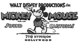
In 1923, brothers Walt and Roy Oliver Disney founded the Disney Brothers Studio. In doing so, they laid the foundation of a legendary entertainment company. It was during this early period that the company brought out one of the most recognisable characters in the world, Mickey Mouse. The character made its debut in the groundbreaking animated short film “Steamboat Willie.”. The success of the film and the character soon made Mickey Mouse the face of the Disney brand.
The original Disney logo featured a profile of Mickey Mouse, with its now iconic circular ears and cheerful expression. In fact, the logo was created by Walt Disney himself and had the image of a walking Mickey Mouse. The emblem had the word “WALT DISNEY PRODUCTIONS Ltd.” at the top and “MICKEY” and “MOUSE” adorning the left and right sides, respectively. The other inscriptions included “TRADE MARK,” “REGISTERED,” “SOUND CARTOONS,” and “2719 HYPERION HOLLYWOOD.”
This simple yet charming design perfectly captured the whimsical spirit of the early animations of the studio and helped establish a strong connection with audiences worldwide.

(1937 – 1948)
The logo iteration of this period had the word “WALT DISNEY” written in both uppercase and lowercase letters. The letters “W” and “D” in uppercase and “i” and “y” in lowercase represented the ears and tails of the character Mickey Mouse.

(1939 – 1983)
The 1939 logo iteration featured a hand drawn illustration of the Mickey Mouse in an upright position with an orange outline. Beneath it was written “WALT DISNEY PRODUCTIONS” in bold, uppercase, and in a sans-serif typeface.

(1940 – 1986)
This logo iteration saw the image of Mickey Mouse with a paint brush in hand looking upwards. Using a red paint jar kept by the side, it is shown painting the wordmarks “WALT DISNEY” and “PRODUCTIONS” in two levels, in red and black, respectively. The logo elements are enclosed within a solid inverted triangle in orange with rounded corners.

(1948 – 1979)
The revamped logo of this era looked handwritten but did not have the letters in italics.

(1972 – 1983)
The logo iteration of this era coincided with the launch of a studio. It was similar to the logo of 1937, with only the word “Productions” placed at the bottom.

(1983 – 1985)
The 1983 logo iteration saw the wordmark “Walt Disney” remain unchanged, while the word “Productions” in the next level changed to “Pictures.” The letters of the word were made larger using a serif typeface.

(1985 – 2006)
As the Disney studio grew in both size and ambition, the logo underwent its first major transformation. It was inspired by the majestic Bavarian castle Neuschwanstein and featured a stylized castle design. It reflected the taste of the Walt Disney logo designer of the time. This change marked a significant shift in the company’s brand identity. The design moved away from the more playful Mickey Mouse motif to a more regal and sophisticated image. The castle became a symbol of the enchanting worlds that Disney created. It captured the imagination of audiences and invited them to experience the magic of its stories.

(2006 – 2011)
In 2006, the Walt Disney logo underwent another evolution that reflected the technological advancements in animation the company was making at the time. The new logo featured a magical castle with the text “Walt Disney Pictures” prominently displayed beneath it. The logo showed a falling star to symbolise the fairy-tale wishes of the film studio.
This updated design was a testament to Disney’s commitment to pushing the boundaries of storytelling and embracing new technologies. The castle remained the central element. However, its sleeker and more modern appearance signalled the company’s willingness to adapt and stay relevant in a rapidly changing entertainment landscape.

(2011 – Present)
In 2006, Disney unveiled its current logo, which has become an instantly recognisable symbol across the globe. This version features a highly detailed depiction of Cinderella’s castle, with all its iconic spires and turrets. Also, while maintaining the classic elements of the shooting star and the square border, the new logo exudes a sense of grandeur. It captures the company’s focus on creating unforgettable experiences. The intricate details of the castle serve as a reminder of Disney’s attention to craftsmanship. It also reminds Disney’s ability to transport audiences to the realms of fantasy and wonder.

The Elements of the Walt Disney Logo
Font
The wordmark used in the Walt Disney logo uses the signature of the founder of the company.
Colour
The entire imagery of the Walt Disney logo comprising the castle, the waterbody, lights, and the wordmark is rendered using a wide colour palette of bright colours. The use of such colours creates an illusion of magic and power.
Finally
The Walt Disney logo has undergone a remarkable evolution over the years, which reflects the company’s growth, innovation, and dedication to storytelling. From the early days of Mickey Mouse to the present-day design of a castle, the iconic symbol has played a crucial role in the unparalleled success of Disney. In fact, more than just a visual representation, the Disney logo has become the most recognisable element of the brand. The logo serves as a constant reminder of the company’s unwavering focus on creating magical experiences that resonate with consumer emotions everywhere in the world.