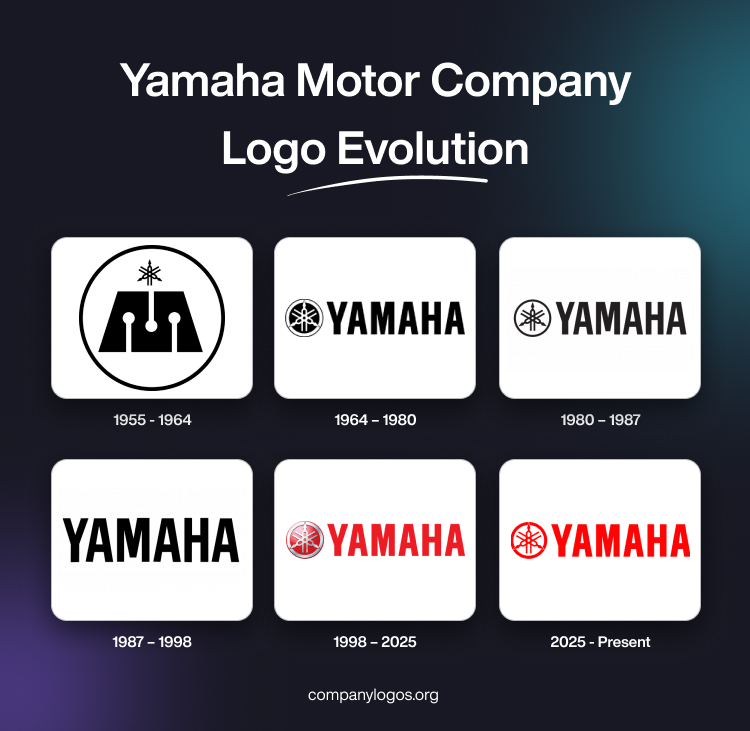
Yamaha Motor Company was established in 1955 as a spin-off from Yamaha Corporation to focus on motorcycles and motorised products. The logo of Yamaha Motor Company initially inherited the tuning fork symbol and later developed its own visual identity to distinguish itself from its parent company. The article delves into the logo evolution of Yamaha Motor Company, among other details.
The Genesis of the Yamaha Motor Company Logo (1955 – 1964)
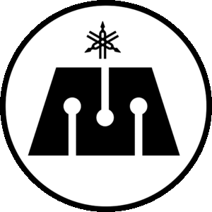
The debut Yamaha Motor logo featured a large “M” in solid black and three tuning forks, also with black outlines. The stylised tuning forks were arranged in a pattern—one at the centre and two crisscrossing the one at the centre from the right and left. The tuning fork symbol was placed above the “M” symbol to thank the parent company that makes musical instruments. The elements, tuning forks, and the “M” symbol were placed within a hollow black outline. The design honoured the musical heritage of the company while establishing its new direction in motorised products.

(1964 – 1980)
The 1964 logo variant of the Yamaha Motor Company saw several changes. These include the removal of the large “M” and the reconfiguration of the tuning forks and enclosing them in a double ring. The tuning forks were depicted in white against a solid black circular background. The edge between the two concentric circles (solid black at the centre and one with a surrounding black outline) was shown in white. Besides, the brand name “YAMAHA” was added to the right of the tuning fork symbol. It was rendered in black in a clean, modern font to enhance readability and brand recognition.

(1980 – 1987)
In the 1980 logo iteration, the previous logo elements, such as the tuning forks symbol, were retained, but with changes to their colours. For instance, the emblem was made lighter by switching the colours of the tuning forks (white to black) and the background (black to white). Besides, the lines of the letters in the wordmark were refined to make them appear more elegant.

(1987 – 1998)
The logo iteration of 1987 saw the removal of the tuning fork emblem, while retaining the single wordmark “YAMAHA” in bold uppercase. The emblem was removed to achieve a minimalist and modern appearance.

(1998 – 2025)
The previous logo design was refined by changing the colour combination. The tuning fork emblem was changed into metallic grey and gradient red. The circle in the background and edge lines were coloured in gradient red, while the dividing stripe and forks were given a metallic hue. The wordmark, on the other hand, was rendered in bright red.

(2025 – Present)
For the first time in 27 years, Yamaha Motor Company updated its logo to coincide with its 70th anniversary. The new design features a flat tuning fork emblem in two dimensions set against a white background. It is optimised for digital platforms and modern branding needs. The wordmark in a traditional sans-serif typeface sits beside the emblem in red. The tagline “Revs Your Heart” is placed below in black with extended legs of “R” and “Y” underscoring the rest of the letters.

The Elements of the Yamaha Motor Company Logo
Symbol
The tuning forks symbolising the musical heritage of the company are arranged in a configuration to symbolise the wheel of a motorcycle. The tuning forks represent “The Customer,” “The Society,” and “The Individual.” These are the principles followed by the company to create value in order to surpass customer expectations. Also, these are aimed at fulfilling responsibilities as a corporation to the society.
Font
The wordmark used as a part of the logo of the Yamaha Motor Company is rendered in a traditional and bold sans-serif typeface. It is similar to the Helvetica Bold Condensed font.
Colour
The colour used in designing the tuning fork emblem as well as rendering the wordmark “Yamaha” is vibrant red. However, the colour of the tagline “Revs Your Heart” is shown in black.
Finally
The Yamaha Motor Company logo is more than a corporate symbol. It is a visual narrative of the company’s journey from a musical instrument maker to a global leader in motorised products. Each evolution of the logo reflects Yamaha’s commitment to innovation, quality, and its harmonious blend of tradition and progress.