Meta is the US-based multinational holding company founded in 2021. It owns a few world-renowned digital platforms, namely, Facebook, Instagram, WhatsApp, and Oculus. The company aims to create an entire universe of virtual reality called Metaverse or Meta Universe. The Meta logo is represented by the infinity symbol to symbolise limitless possibilities. The article delves into the evolution of the Meta logo from its predecessor, Facebook, among other details of the company.
The Genesis of the Meta Logo (Before 2021)
Since Meta is derived from the identity of Facebook, the logo of Facebook can be said to be the forerunner to the Meta logo. The Meta logo was introduced in 2021 and it features a blue infinity loop and the wordmark “Meta” in black. The infinity loop also resembles the letter “M” to symbolise both infinity and meta-thinking. The infinite loop represents the boundless potential of the metaverse. The 3D-inspired logo looks different depending on whether it echoes the immersive and spatial nature of the metaverse.
The accompanying wordmark “Meta” is written in a clean, modern sans-serif font that focuses on simplicity and clarity. The infinity loop symbol is designed using blue, which subtly connects it with Facebook’s legacy while presenting a forward-looking identity. Meta describes the symbol as “dynamic,” or evolving as users interact with it in 3D environments.

The Constituents of Meta
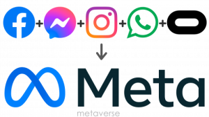
Meta, or Metaverse, not only includes Facebook, but other digital platforms as well, namely, Messenger, Instagram, and WhatsApp.

The Elements of the Meta Logo
Symbol
The Meta symbol is a continuous, looping shape that resembles both an infinity sign and the letter “M.” This duality reflects the company’s new name and its vision of infinite horizons in the metaverse.
Font
The wordmark forming part of the Meta logo is written using a traditional sans-serif typeface, which is quite similar to fonts such as Nexa Text Bold and Carmen Sans Semi Bold.
Colour
The Meta logo is designed using a combination of a blue and black colour palette, where the “infinity” emblem is depicted in gradient blue, while the wordmark is rendered in black.
Finally
The Meta logo is a powerful visual statement of the company’s evolution from a social media giant to a pioneer in the digital frontier. Its infinity-inspired design, innovative creation process, and multi-layered symbolism capture Meta’s vision of boundless creativity, perpetual innovation, and a future shaped by immersive digital experiences.