Morgan Stanley is a US-based financial services conglomerate that specialises in a wide range of financial and investment services. These include wealth management, investment banking, broking, securities, and investment management. Founded in 1935, the brand identity of this bank has evolved alongside its business.
The Morgan Stanley logo, which happens to be a visual representation of its values and ambitions, has undergone several changes since its inception. The changes reflect the company’s strategy, mergers, and the broader design trends of the financial industry. The article delves into the various logo changes of Morgan Stanley, among other details of the company.
The Genesis of the Morgan Stanley Logo (1997 – 2000)
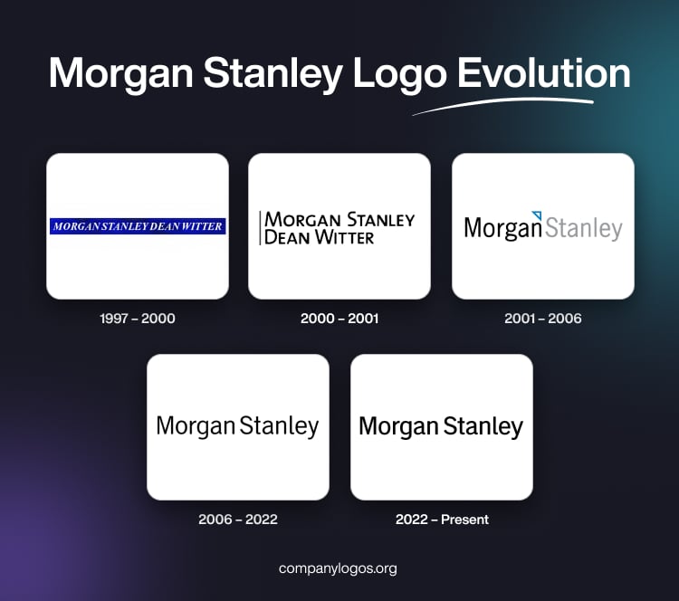
The original Morgan Stanley logo is unavailable, as it is not documented. However, the logo that was designed in 1997 after the bank’s merger with Dean Witter Discover & Co. had the name “Morgan Stanley Dean Witter” in white italicised uppercase on a deep blue horizontally oriented rectangular background. This design aimed to convey the combined strength and heritage of both institutions.

(2000 – 2001)
The logo iteration of 2000 featured in black over a white background. The bank’s name in bold, black was split into two lines, with a black vertical stripe on the left. The typeface used was a flat, austere, and modern sans-serif to reflect a more minimalist and forward-looking approach.

(2001 – 2006)
The company reverted to the name “Morgan Stanley.” Designed by Robert Matza of Landor Associates, the logo during this period featured the wordmarks “Morgan” in black and “Stanley” in light grey, separated by a small white triangle outlined in blue. This subtle graphical element symbolised both the firm’s legacy and its innovative spirit.
According to the company, the graphical element was a directional triangle to convey the general direction of financial success. This period marked an effort to balance tradition with modernity, as the company sought to reinforce its brand recognition while signalling openness to change.

(2006 – 2022)
In 2006, the logo was further simplified by dropping all graphical elements except the name. The wordmark became all black, with minor refinements to the letters, especially the “g,” “a,” and “l.” The font remained a modern sans-serif to emphasise clarity and professionalism. This minimalist approach reflected the broader trend in corporate design toward clean, unembellished logos that work well across digital and print media.

(2022 – Present)
The most recent update to the Morgan Stanley logo is subtle. For instance, the font appears slightly bolder, but the overall layout and style remain consistent with the previous version. The focus is on legibility, digital adaptability, and a timeless, understated confidence. The wordmark that forms part of the current logo is in black and is rendered in a sans-serif wordmark, which is simple, modern, and instantly recognisable.

The Elements of the Morgan Stanley Logo
Font
The brand name that forms a part of the Morgan Stanley logo is rendered using a sans-serif typeface with a clean and modern appearance. There are no serifs at the ends of the letters. The typeface is similar to Trade Gothic Roman, created by Jackson Burke in 1948.
Colour
The colour palette used to design the Morgan Stanley logo consists of black set against a white background. The choice of colours symbolises sophistication, clarity, and neutrality.
Finally
The evolution of the Morgan Stanley logo shows the journey of the firm from a traditional Wall Street bank to a global, digitally savvy financial powerhouse. Each logo redesign has balanced heritage with innovation to ensure the brand remains both relevant and respected in a rapidly changing world.