Airwell is a French company engaged in the manufacture of air conditioning solutions since 1947. Originally called Établissements Guillemin, the company has been a pioneer of heating and cooling technology. In fact, it has developed the first window-mounted air conditioner and the first split-system air conditioner in Europe. Over the decades, the company has expanded its product range and made a strong presence in markets around the world. Throughout the existence of the company, its logo has served as its striking visual identity and a symbol of excellence, adaptability, and a forward-thinking approach.
Over the years, the Airwell logo has undergone a remarkable evolution. It reflects the growth of the company and the transformation in the HVAC (Heating, Ventilation, and Air Conditioning) industry. This article delves into the evolution of the Airwell logo and traces its roots from the establishment of the company to its acquisition by the Swiss group CIAT in 2013.
The Genesis of the Airwell Logo (Before 2007)
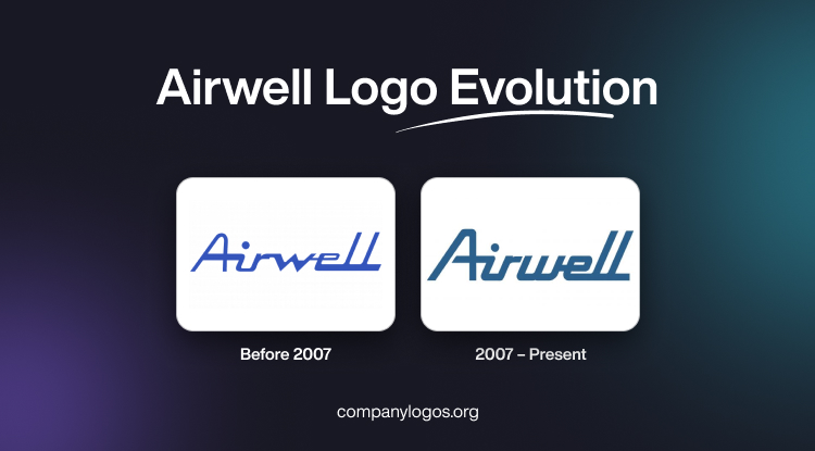
The Airwell logo has undergone two iterations in its history. And each iteration reflects the times and the evolving identity of the brand. Before 2007, the logo showed a stylized representation of an air vent or grille. It was a symbol that the company focused on air conditioning and ventilation systems.
The design of the logo before 2007 had clean lines and a minimalist approach. It conveyed a sense of simplicity and efficiency. The symbolism behind the logo showed the company’s focus on developing innovative solutions based on attributes like comfort, energy efficiency, and reliability.

(2007 – Present)
In 2007, Airwell underwent a comprehensive rebranding exercise. This led to the redesign of its iconic logo. The updated logo featured a more modern and dynamic design. It had a stylized ‘A’ formed by two overlapping curves, which represented the seamless integration of the heating and cooling solutions.
The new logo has a bold and contemporary appearance that reflects Airwell’s efforts to stay ahead of the curve by embracing cutting-edge technologies. Moreover, the overlapping curves show the holistic approach of the company to HVAC solutions. They seamlessly blend the heating and cooling systems to provide optimal comfort and energy efficiency.
Since the present logo was introduced in 2007, it has become a recognizable symbol in the HVAC industry. It appears on the products, marketing materials, and corporate communications of the company. Besides, its clean and sophisticated design continues to resonate with the target audience of the company and conveys a sense of innovation, quality, and reliability.

The Elements of the Airwell Logo
Font
The custom italicised wordmark of the Airwell logo has a distinct typeface. The curved strokes of the typeface evoke a sense of warmth and familiarity. At the same time, the sharp, angular lines and cuts of its characters give it a touch of modernity and strength. This unique choice of font strikes a delicate balance between the heritage of the brand and its forward-thinking approach. It draws inspiration from classic typefaces like Continental Railway and incorporates elements that look sleek and stylish in Cabriolet.
Colour
The Airwell visual identity has a serene, medium-blue colour palette that exudes a sense of stability, reliability, and trustworthiness. The calming palette conveys the fundamental values and commitment of the company to delivering dependable solutions. Further, the choice of blue reinforces the position of Airwell as a steadfast and trusted brand, which customers can rely on for their heating, ventilation, and air conditioning needs.
Finally
The evolution of the Airwell logo is a reflection of the company’s journey over the years. It tells the journey of the company from its beginnings as a heating equipment manufacturer to its current status as a global leader in the HVAC industry. The transformation of the logo has been a visual representation of Airwell’s ability to adapt and innovate.
At the same time, it signalled the core values of the company, namely, quality, efficiency, and customer satisfaction. The logo of Airwell remains a powerful symbol of the excellence of the company and its steadfast pursuit of innovative solutions to enhance comfort and energy efficiency.