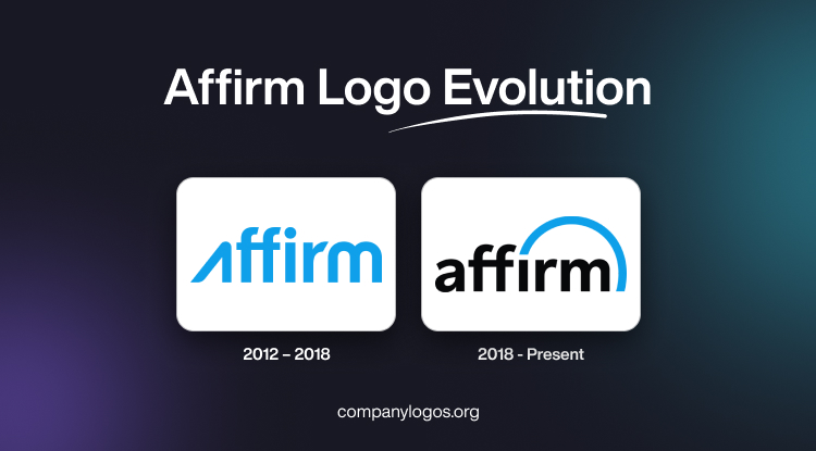
Affirm is a US-based financial technology startup founded by Max Levchin. In fact, it was Levchin, who, by virtue of being a co-founder of the iconic PayPal, had made a name for himself in the world of fintech. However, it was with Affirm that he sought to revolutionise the way consumers approach purchases, both online and in-store.
The core concept behind Affirm was about introducing a “Buy Now, Pay Later” (BNPL) service to allow shoppers to break down the cost of their purchases into more manageable instalments. This idea aimed to provide an alternative to traditional credit cards. It offered transparency, flexibility, and a more responsible approach to managing finances.
An important part of the Affirm brand is its logo, which was changed only once. It represented the attributes of the company in terms of professionalism, innovation, and trustworthiness. The article traces the journey and evolution of the Affirm logo through the years.
The Genesis of the Affirm Logo (2012 – 2018)
The logo of Affirm in its earliest variant was devoid of any graphic element and just carried a wordmark with the name of the company. It was designed in cyan colour to offer a sense of trustworthiness and innovation. The wordmark was rendered in a bold and geometric sans-serif typeface where the letters “f” appeared as mirror images of each other connected together by a horizontal bar or stroke.
The letter “A” with a rounded top had diagonal left and vertical right lines forming a sharp angle. Executed in uppercase, the letter “A” did not carry the usual crossbar in the middle. Also, it matched the glyphs in lowercase. The letter “r,” especially its upper part, sported a diamond cut, thereby appearing dynamic. Finally, the upper part of the letter “m” was arched to form symmetry. Moreover, it did not have any vertical projection at the beginning.

(2018 – Present)
The 2018 logo iteration featured a clean, sans-serif typeface to reflect the adherence of Affirm to simplicity and transparency. However, the most striking element of the redesign was the addition of an arc symbol. It represented optimism, adaptability, and the forward-thinking approach of the company. The logo redesign offered a striking contrast with the wordmark in black set against a white background. The entire thing had a bright blue arc to symbolise the overarching commitment of the brand to support and positivity. The twin letters “f” appear as mirror images of each other but are grounded to show reliability and stability.

The Elements of the Affirm Logo
Font
The wordmark forming the visual identity of Affirm uses a bold, custom sans-serif typeface. The typeface is similar to Xyngia Demi Bold by ROHH.
Colour
The colour palette of the logo consists of blue and black. Here, black gives the logo a versatile and universal quality, while blue provides brand recognition, customer attention, and familiarity.
Finally
Through its inception, strategic partnerships, nationwide expansion, public listing, and visual transformation, Affirm has firmly established itself as a disruptive force in the financial technology sector. Its logo continues to define the brand and convey its values to its users. With its focus on transparency, accessibility, and consumer empowerment, the company continues to shape the future of finance, one innovative solution at a time.