VH1, or Video Hits One, is a US-based TV channel that was launched in 1985 by Warner Amex Satellite Communications in New York City. It was conceived as a variant of MTV to play music only for people over 25 years old. However, with time, the channel changed its content structure to include reality shows and other sundry programmes. Today, it is owned by CBS Entertainment Group and is controlled by BET Networks.
The VH1 logo has undergone several changes since the founding of the channel in 1985. These reflect both shifts in branding strategy and broader changes in music and pop culture television. The article delves into the various logo changes of VH1, among other details.
The Genesis of the VH1 Logo (1984 – 1985)
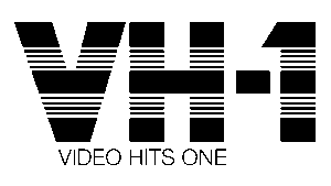
The original logo of VH1 features the massive wordmark “VH-1” in sans-serif letters with a horizontally striped pattern in black and white. The letters had thick black patterns at the top, middle, and bottom. Beneath it was written the phrase “VIDEO HITS ONE” in a smaller size in black.
(1985 – 1987)
In the first logo change, the full name written below was removed, and the main text “VH-1” was rendered in orange. The right vertical bar of the letter “V” was connected to the letter “H” at the top.

(1987 – 1994)
The 1987 logo iteration introduced more abstract, geometric shapes to spell out “VH1.” This gave the brand a playful and creative energy. The figures included an inverted triangle, a rectangle, and another rectangle with an inclined top bar. There were small white triangles placed on top of the first triangle, both vertical ends of the second rectangle, and the left side of the third rectangle.

(1994 – 1998)
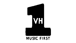
In 1994, VH1 was rebranded with a logo that featured the letters “VH” in a much smaller size in white within a prominent and large “1” in black. Beneath it was the slogan “Music First” in uppercase without serifs. This design emphasised the channel’s commitment to music programming.
(1998 – 2003)
In 1998, the previous logo iteration evolved into a more minimalist look. It adopted a blue colour palette and a circle motif, and the text “Music First” below.

(2003 – 2013)
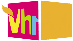
In 2003, VH1 introduced a bold new era with a box logo. It was a pink square containing the “VH1” initials, often with orange or other vibrant colour accents. This design was described as “funkadelic” and “slightly retro,” with some 3D elements similar to MTV’s branding. There was another square in orange at an angle to the pink square. Together, they created an optical illusion of a box. Further, the pink square had the brand name, where the letter “V” had a protruding orange leaf.
(2013 – 2016)
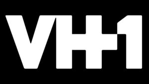
The next logo design of VH1 came in 2013, wherein it introduced a simplified wordmark “VH-1” in purple. The letter “H” had a distinctive plus sign incorporated into the logo. The plus sign was intended to symbolise VH1’s blend of “music + pop culture + nostalgia.” The new logo was a single-colour typeface and has moved away from the complex, multicoloured designs of the past.

(2016 – Present)
Since 2016, VH1 has used a refined version of the 2013 wordmark in white set against a black rectangular background. The logo is aligned with the vision of VH1 of modernity and progress in the music industry.
The Elements of the VH1 Logo
Font
The wordmark used in the VH1 logo uses a massive, bold sans-serif typeface where the “+” sign is woven into the horizontal bar of the preceding letter “H.”
Colour
The logo employs a black and white colour combination to depict minimalism.
Finally
Over the years, the VH1 logo has reflected the evolving identity of the channel. It represented the transition of the channel from a music video hub for adults to a pop culture and reality TV powerhouse. In doing so, the logo adapted to design trends and audience expectations.