Advan is a premier Japanese tyre brand belonging to the Yokohama Rubber Company. It has been a symbol of quality and performance for over six decades. While the tyres have consistently delivered on the promises of grip, durability, and handling, the logo of the company shows the changing times and design trends of the day. The article delves into the history of the Advan logo since the founding of the company, among other details of the company.
The Genesis of the Advan Logo (1979 – Present)
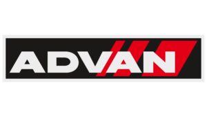
The original Advan logo adopted a striking, angular logotype that exuded a sense of dynamism and modernity. Also, since the logo hinted at the products manufactured by the company, it appeared with three slanted red stripes that resembled the tread of a tyre. The stripes, too, appeared in the form of parallelograms of varying widths. The parallelograms were partially obscured from view, thanks to the white wordmark “ADVAN.” Both the wordmark and parallelograms were placed on a black rectangular background for better legibility.
Further, the red stripes in the form of parallelograms gave the impression of slip marks on the road, but in a much cooler way. Interestingly, the letters “V,” “A,” and “N” are placed in such a way that they appear to be aligned with the angles of the parallelograms. Undoubtedly, the logo gave the impression of the company in more ways than one. The colour palette of the wordmark in white lets the world know that the company knows everything about the tyre industry.
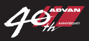
(2018) (Anniversary Logo)
A commemorative logo was introduced in 2018 to celebrate the 40th anniversary of Advan. It featured the wordmarks “40th”, “Advan”, and “Anniversary” in white against a black rectangular background along with three red parallelograms of various thickness. The hand painted wordmark “40th” to the left of the logo was bigger in size. Also, the brush stroke emanating from “4” went through the numeral “0’. The other two wordmarks were relatively smaller in sizes and were placed to the top and bottom right.
The Elements of the Advan Logo
Symbol
At the centre of the Advan logo is a combination of three red parallelograms. The shapes of these geometric objects were ingeniously inspired by the traces left by the tyres on the highway. This way, the parallelograms visually represented the core product offering of the brand, the quality tyres. The shape of the letters in the Advan wordmark has been meticulously crafted to align with the angular geometry of the parallelograms. Just observe how the slanted angles of the letters “A,” “V,” and “N” align seamlessly with the precise angles at which the parallelograms are positioned. This creates a harmonious and cohesive design.
Font
The Advan wordmark is written using a geometric sans-serif typeface in uppercase. It closely resembles ITC Avant Garde Gothic Medium. The bold lettering conveys precision, speed, and modernity.
Colour
The colour palette of the Advan logo was thoughtfully chosen to evoke the essence of the product itself. For instance, the dominant black background conjures a connection of sorts with the bold colour of the tyre. On the other hand, the crisp white letters of the brand name provide maximum contrast and legibility. The vibrant red accents, when strategically applied to the parallelograms, infuse a dynamic and energetic touch. They capture the brand’s spirit of performance and innovation.
Finally
The Advan logo is a testament to the ability of the brand to remain true to its core values and identity. It reflects design trends and conveys a sense of performance, precision, and technological advancement. Over the years, the Advan logo has evolved into a powerful symbol that represents the determination of the brand to deliver exceptional products and experiences for its customers.